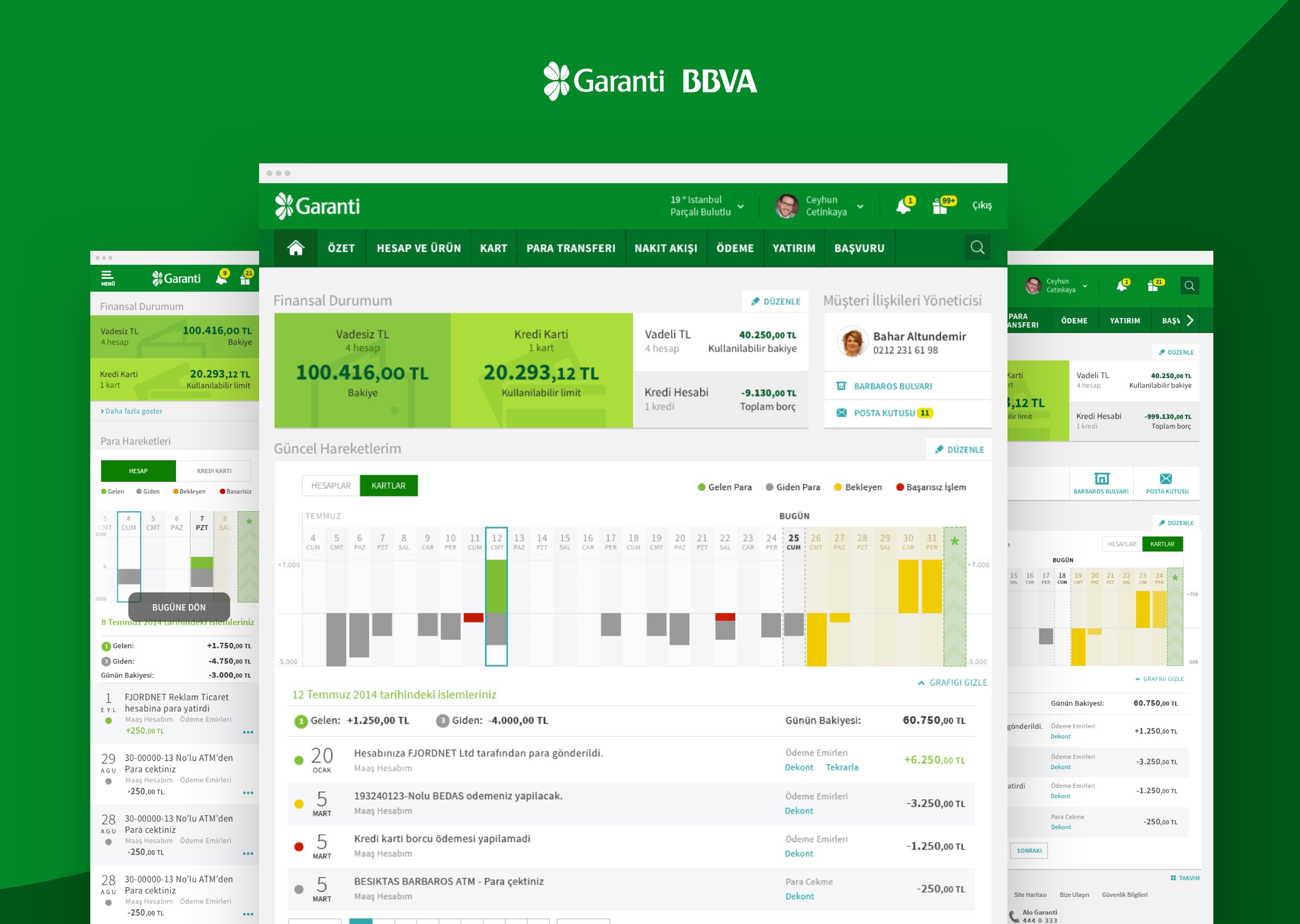
The engagement
Garanti is the largest private bank in Turkey. Twelve million customers, more than nine hundred branches, and by the time of the project around three million people using the online banking platform every month, across nearly two hundred features. They had been growing online banking aggressively for over a decade, and were widely regarded as the digital leader in Turkish retail banking. They had set conventions other banks copied, won industry recognition across categories, and built a reputation as the bank that made the digital move first. Our brief was to help them keep doing that. Not to catch up. To stay ahead.
Fjord Istanbul was brought in to redesign the platform. The remit was broad: improve the experience, modernise the visual language, and bring the dashboard up to where digital expectations had moved since the original platform shipped. Six months, with the desktop site as the primary surface and tablet and mobile views in scope.
I led the engagement as design director. The Fjord team was small: four people, including me as lead and three designers with mixed backgrounds across service, visual, and interaction design. We worked exclusively with Garanti's internal teams from there — business analysis on one side, development on the other. Garanti ran one of the largest in-house tech setups in Turkish banking at the time, with over four hundred people across engineering and analysis. Online banking, like everything else at that scale, was not built by one team. It had been built by many teams over more than a decade, and the structural consequence of that is the thing that defined the project.
What follows is the version of the case study I can write honestly about: the structural moves I owned, and the work the team did across the production phase. The visual design language is not mine; that was led by colleagues whose portfolios cover that work in detail. The system architecture, the audit that produced it, and the dashboard frame are where my direction shows up.
The audit that changed the brief
The first decision on the project was not a design decision. It was to stop and look.
Before any of the design work began, we spent the first three months auditing the existing platform. Eight hundred-plus pages, built over more than ten years, across nearly two hundred features. Each page had been commissioned through its own business analysis, designed in its own session, and shipped to its own logic. No shared component library. No common input pattern. No consistent navigation grammar.
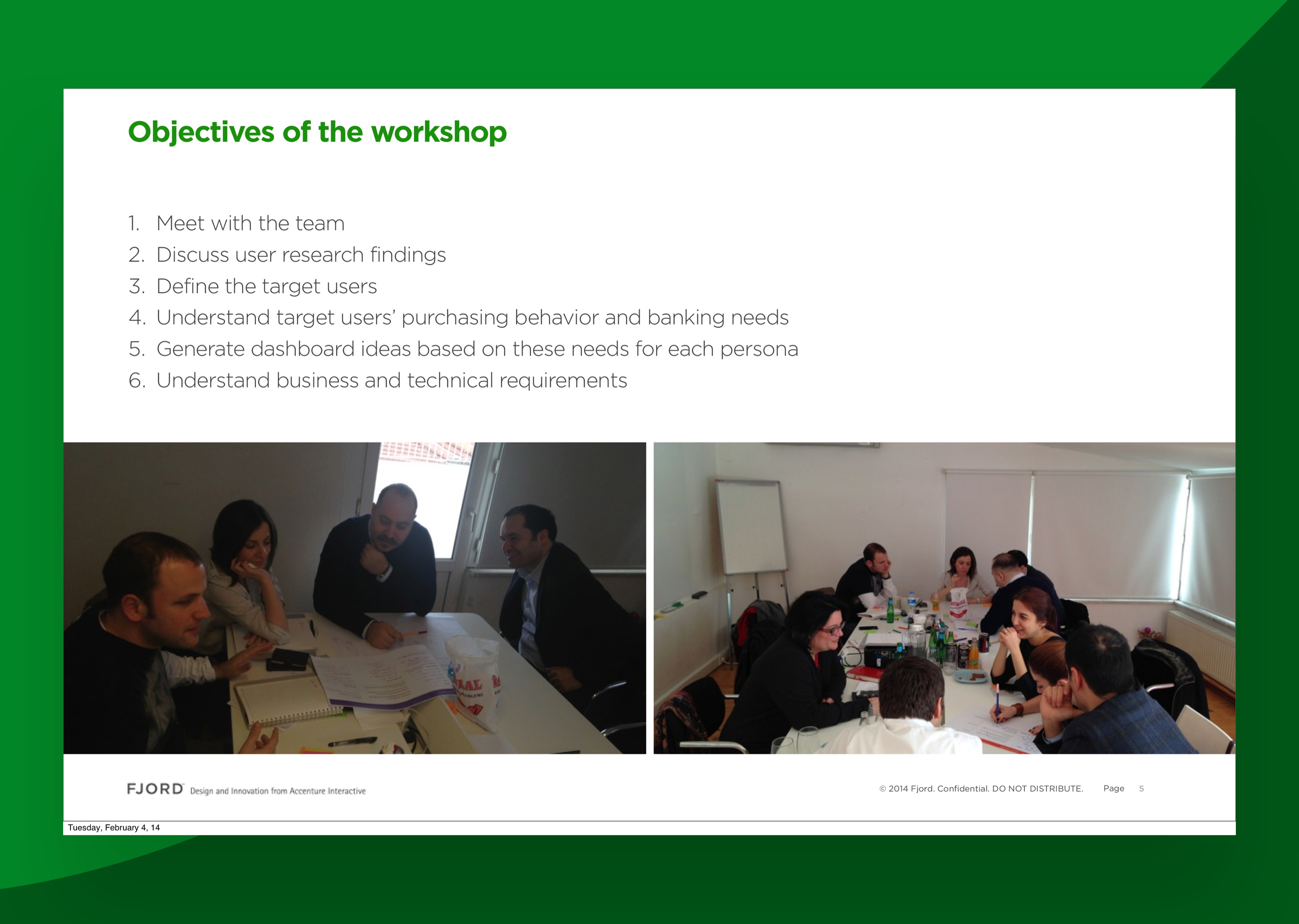
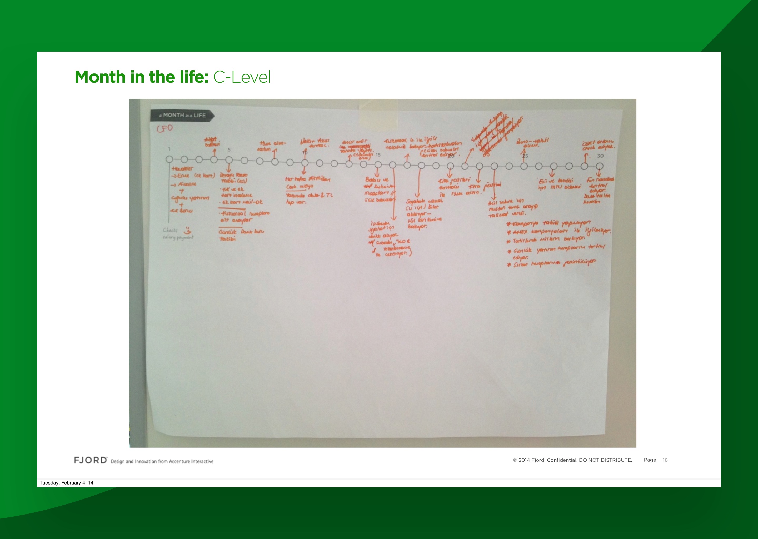
Two pages that did almost the same thing rarely looked or behaved the same way. The same input field might appear in several forms across the platform, each with different spacing, different validation, different copy. The same transaction list might be rendered three different ways depending on which feature it sat inside. None of this was anyone's fault. It was the cumulative residue of a decade of feature pressure with no time to consolidate.
The audit catalogued the patterns. We walked through every screen with the engineering and business teams, logging what each page did, what conventions it used, where it forked from the rest of the platform, and which inconsistencies were genuine product distinctions versus accidents of history. By the end of the three months we had a map of the platform that nobody inside the bank had ever assembled.
The map did most of the strategic work. Without it, we would have spent the rest of the engagement arguing about screens. With it, the brief became clear. The intervention was not a redesign. It was a reset of the system underneath the redesign.
The decision: stop authoring pages, start composing them
The shape of the audit gave us the answer.
The eight hundred pages were not eight hundred distinct problems. They were a much smaller number of patterns, repeated in inconsistent ways. The same handful of structures showed up across the platform, rebuilt many times because there was no shared component to draw from. Build a single canonical version of each, with the variations the platform actually needed, and most of the inconsistency disappears by construction.
We pulled the patterns out of the existing pages and rationalised them down to a system of around forty components. None of it invented. All of it extracted from what the bank was already trying to do.
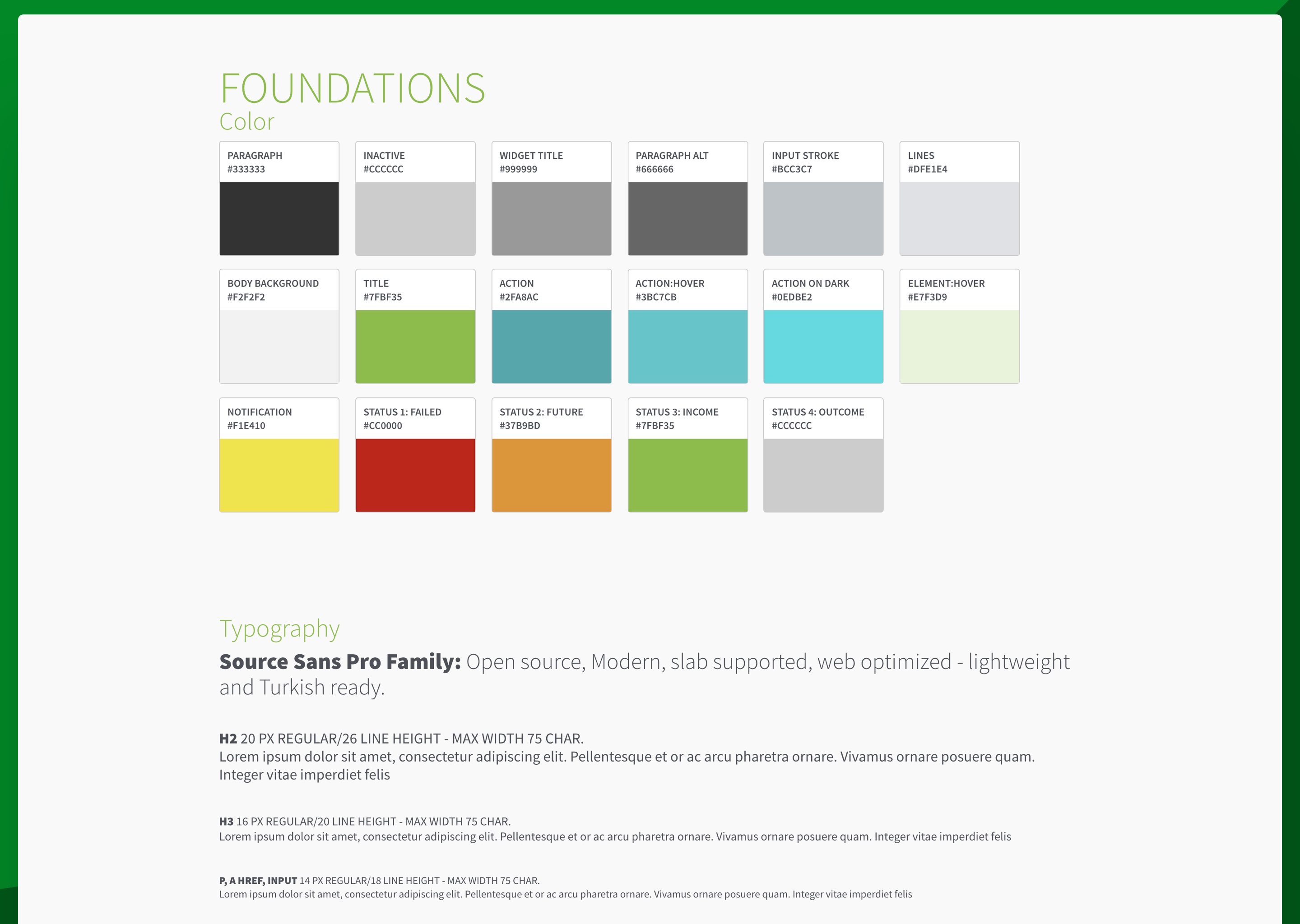
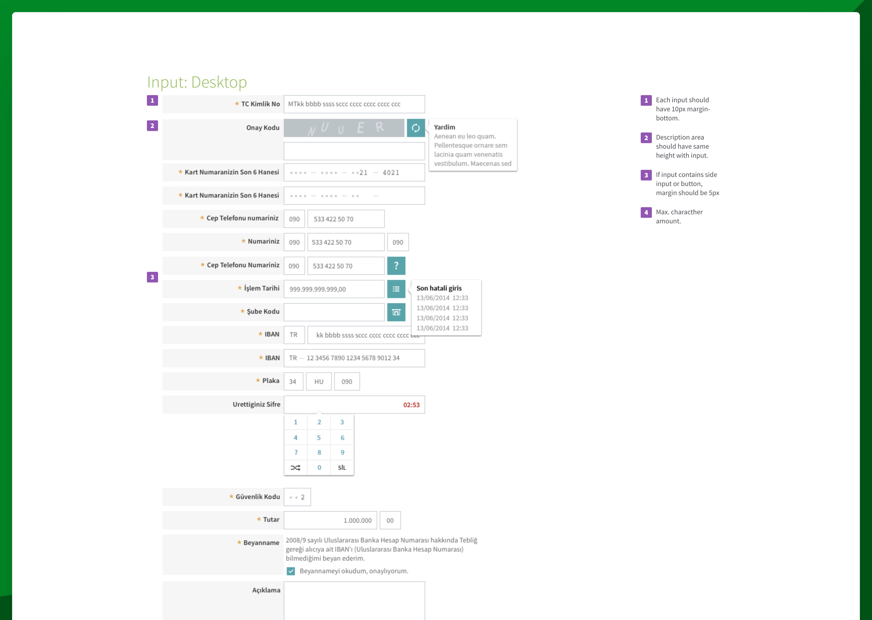
The foundations sat underneath. A colour system with semantic roles rather than decorative ones, including a four-status palette covering failed, future, income, and outcome states alongside the action, hover, and notification colours used across the interface. A typeface and type scale selected for the platform's needs. Input rules with consistent margins, label placement, and helper patterns. Status colour and iconography that worked across the component set rather than being re-decided per screen.
Once the system existed, the bank could stop authoring pages and start composing them. New features could be assembled from the component library rather than designed and built from scratch. Engineering had a shared reference. Business analysts had a vocabulary. Design had a kit. The fact that this is now standard practice is precisely the point. In 2016, at this scale, in a Turkish enterprise banking context, it was not.
Research, in service of the system
In parallel with the audit, we ran user research. Not as a separate workstream that would produce its own deliverable, but in service of the questions the audit was raising about where the platform actually struggled.
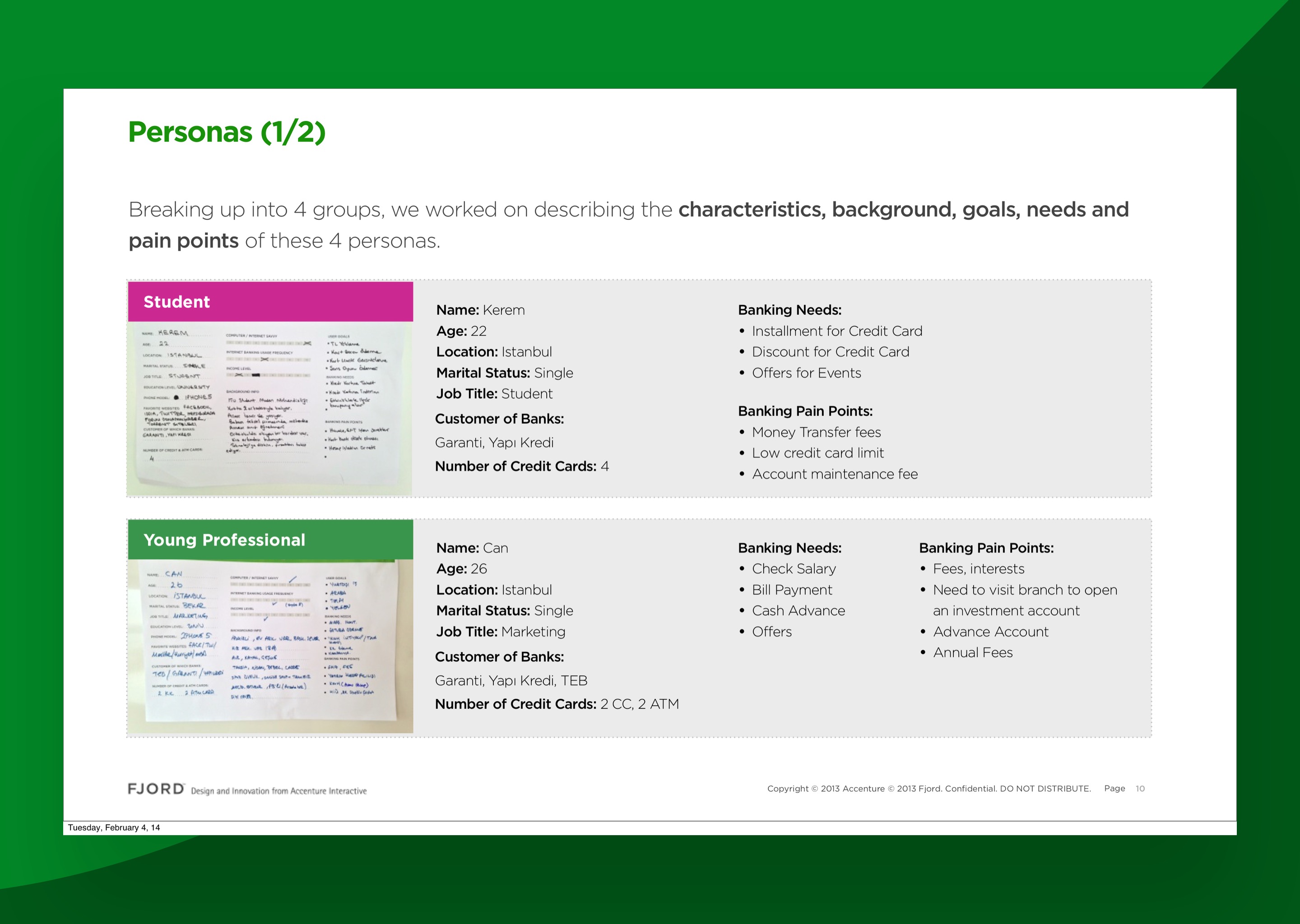
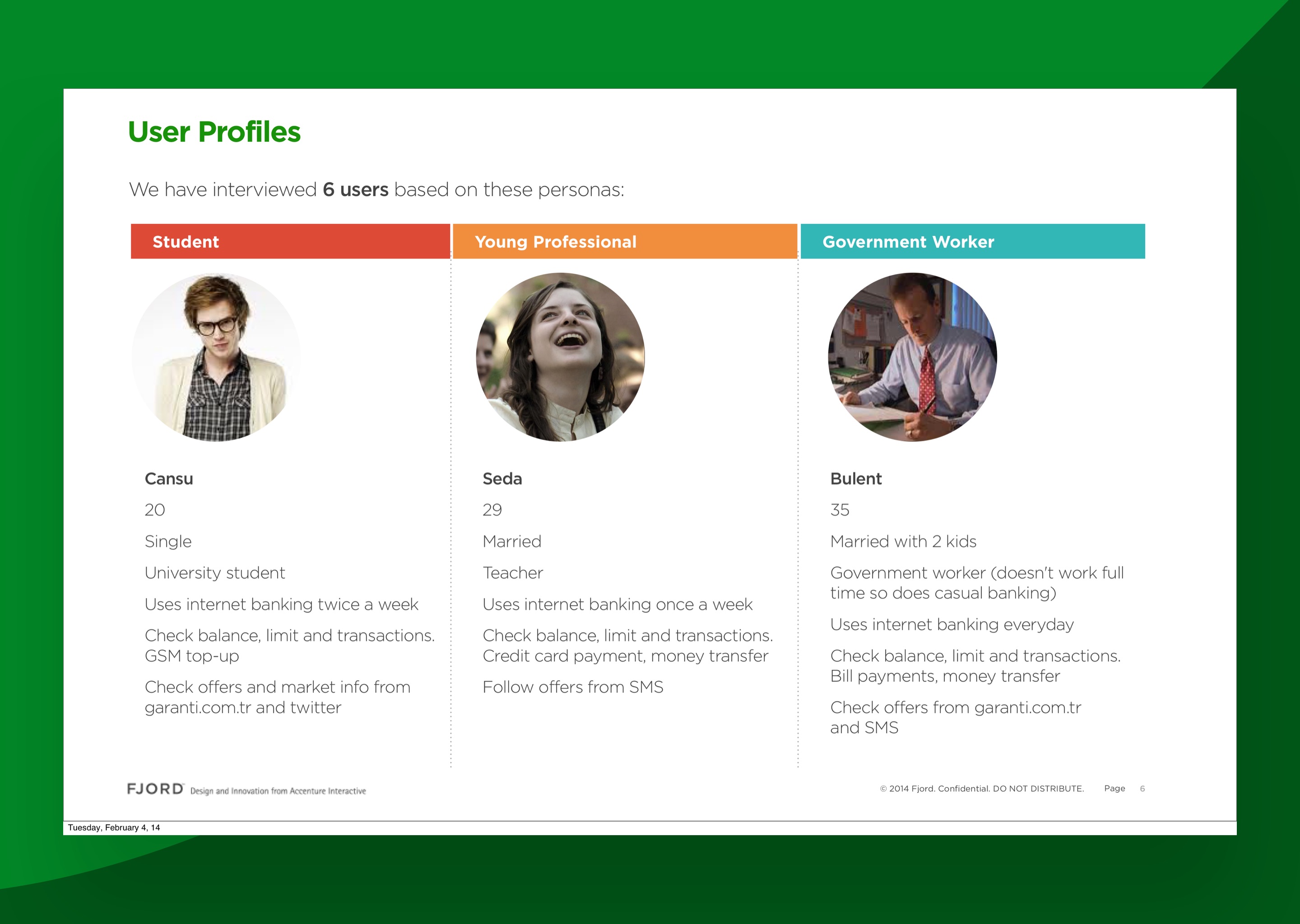
The qualitative side started with four personas across the spread of Garanti's customer base: a student, a young professional, a government worker, and a higher-tier customer managing more complex finances. Six users interviewed in depth in the first round, sessions running long enough to talk through how they actually saved, spent, transferred, and worried about money.
The qualitative work did not stop there. We ran four further rounds of user testing across the rest of the engagement, against successive prototypes as the system and the dashboard took shape. Each round tightened the gap between what we thought the design was doing and what users actually did with it. The dashboard, the calendar view, the credit card detail screen, and the profile area all went through multiple rounds before they hit production.
The quantitative side mattered just as much. Garanti has serious internal analytics and was willing to share usage data across the platform: which features got opened, which got abandoned, which transactions tied up support time, which paths were ridden by ten percent of users and which by ninety. We used that data to set priorities. Not which features to build (the bank knew its product), but which surfaces and flows the redesign needed to get right first. A dashboard element used by every active user every week is a different problem from a settings screen visited once a year. The quantitative usage data told us where the risk and the reward both lived.
Workshops with the Garanti team aligned the bank on who we were building for and which pain points were universal versus persona-specific. Money transfer friction. Branch dependency for routine operations. Profile completion as a constant low-grade nag.
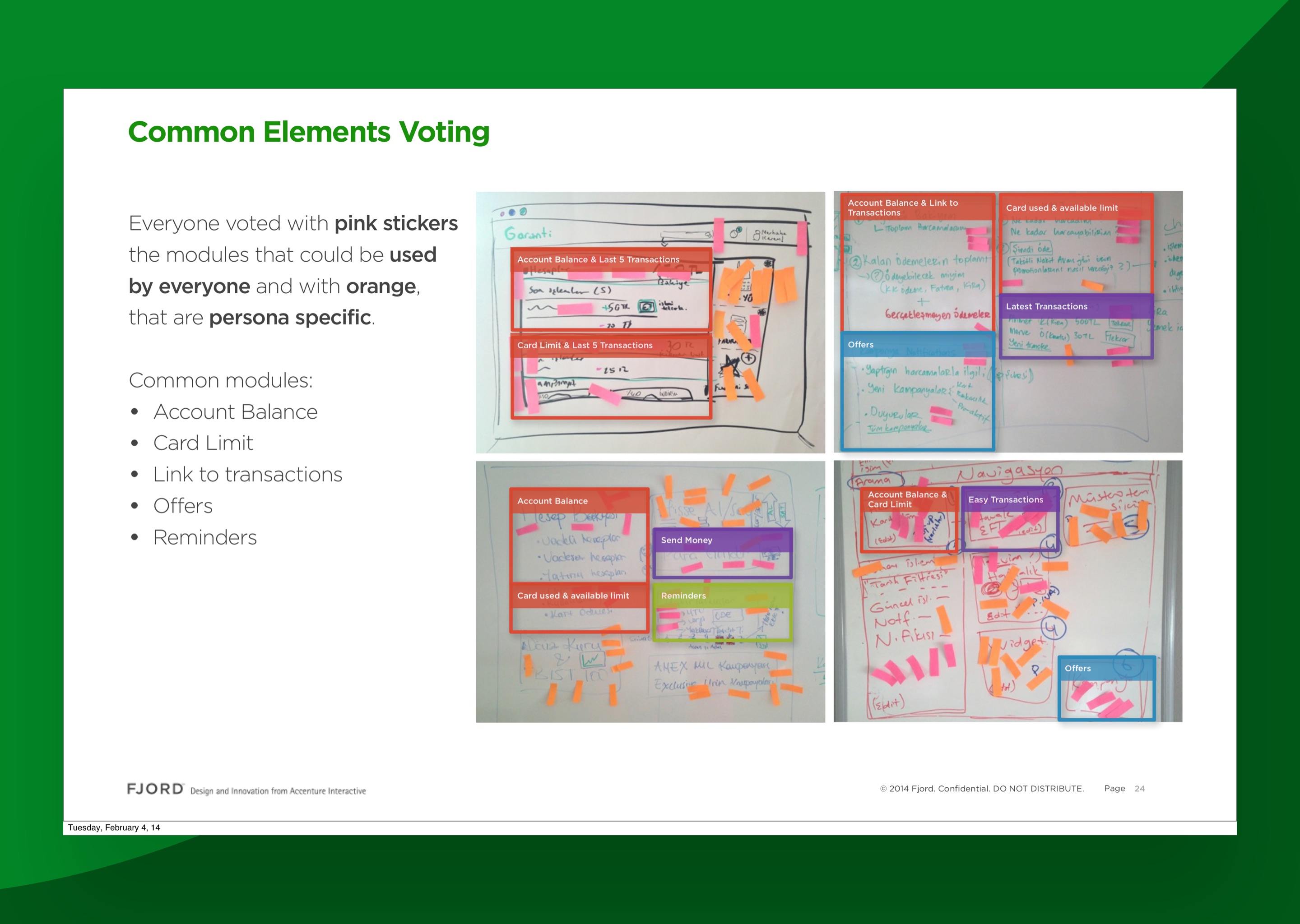
One workshop in particular shaped the dashboard. We laid out the surfaces of the existing home screen and the candidate elements for the new one, and had the team vote on which were universal across personas and which were persona-specific. Account balance, recent transactions, card summary, and reminders came back as universal. Offers, promotions, and richer planning surfaces came back as persona-specific. That distinction became the spine of the dashboard design.
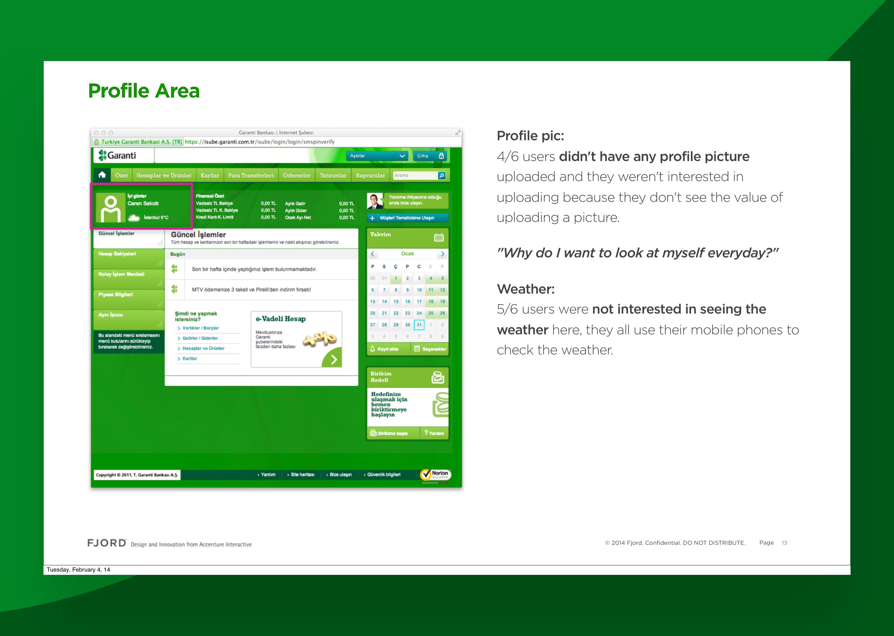
Some of the findings were quietly clarifying. Four of six interviewed users in the first round had not uploaded a profile picture and explicitly did not want to ("why do I want to look at myself every day?"). Five of six did not care about the weather widget on the home screen because they checked the weather on their phones. These are small observations. They mattered because the existing home screen was carrying both as primary real estate. Cutting them freed space for the things the same users said they did want.
The dashboard: where the system met the user
The last third of the project focused on the most-visited surface in the platform. The dashboard was where the system had to prove it could carry a real product, not just look coherent in a style guide.
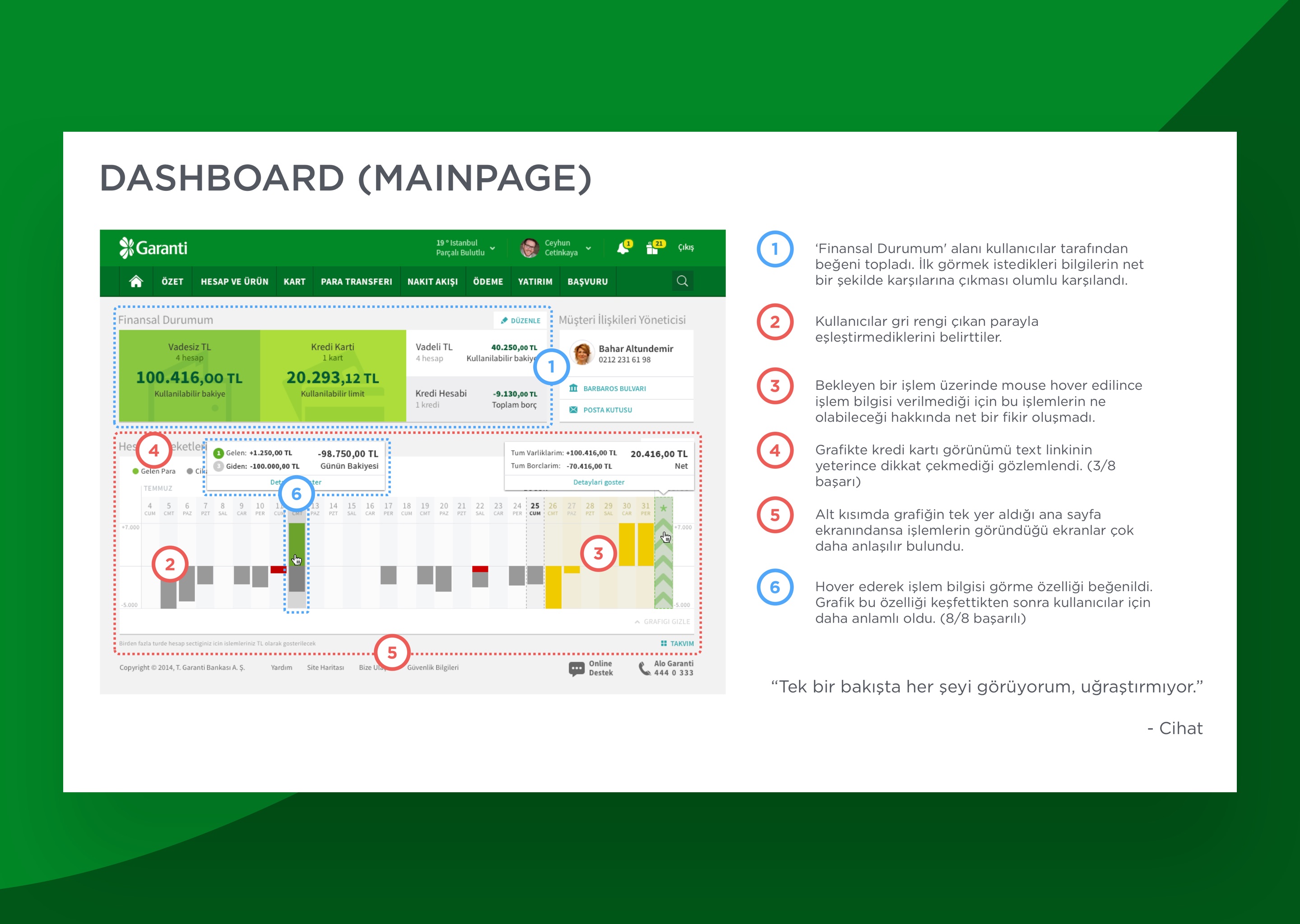
The redesigned summary sat at the top: account balances, credit card status, available limits, total assets and liabilities, all visible without scrolling. The "Financial Status" block was the most positively received element in user testing. One participant summed up the read we were aiming for: "Tek bir bakışta her şeyi görüyorum, uğraştırmıyor." I see everything at a glance, it doesn't make me work. That was the test we wanted the dashboard to pass.
Underneath the summary, a transaction visualisation showing past, present, and future state. Days mapped along the horizontal, money in and money out mapped vertically. Incoming, outgoing, pending, alerts, all coloured by status from the system. The visualisation extended into the near future, which mattered because showing committed payments and scheduled transfers before they hit gave users a meaningful read on their position rather than an after-the-fact statement.
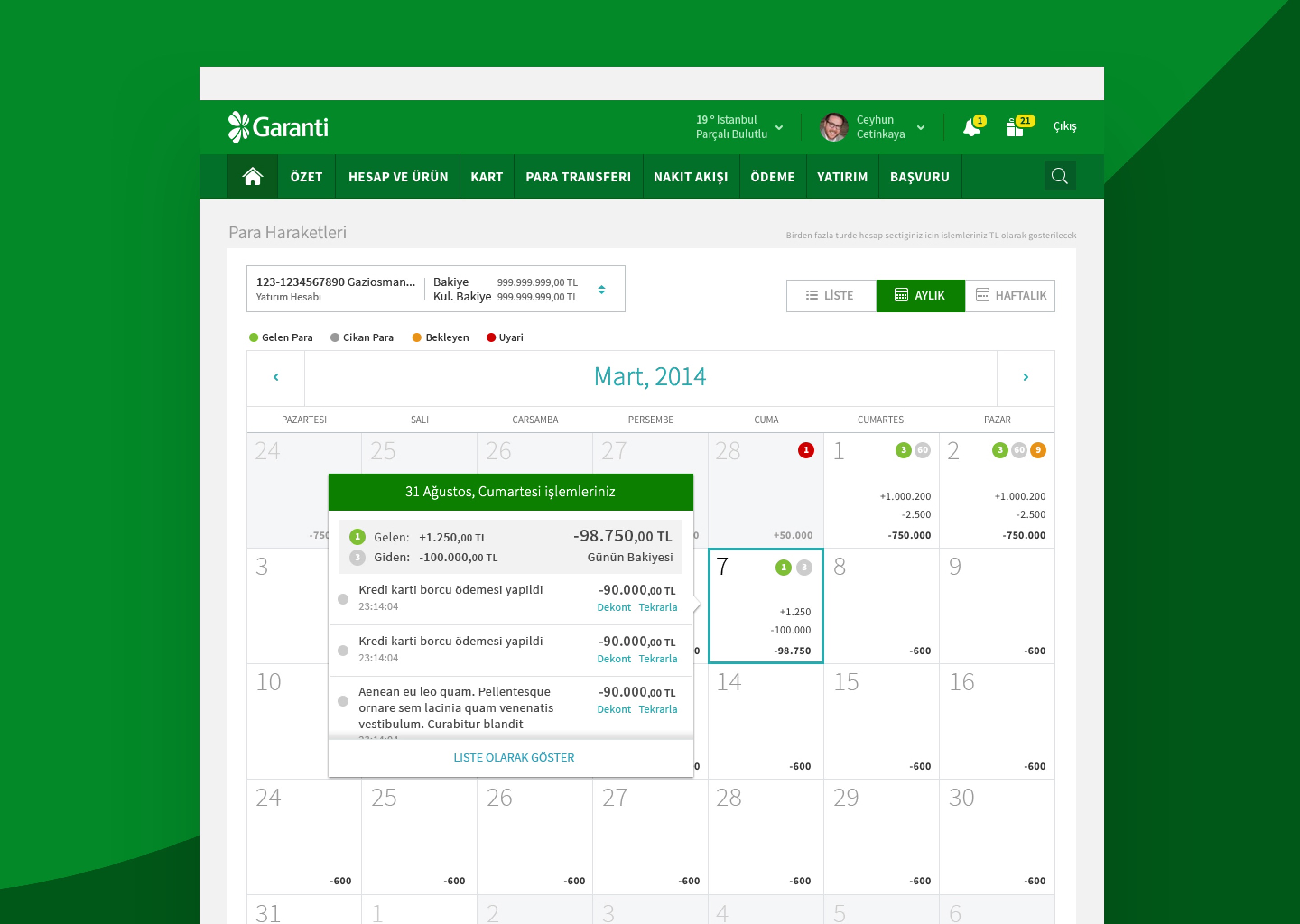
The calendar view was the alternative read for the same data. Same underlying transactions, different organisation: a month-long grid with each day showing its incoming, outgoing, and pending totals, and a tooltip surfacing the individual transactions on hover. Users in testing discovered the hover behaviour quickly and described the calendar as more meaningful once they did. The calendar and the time-series were the same intelligence applied to two reading modes: scan, and explore.
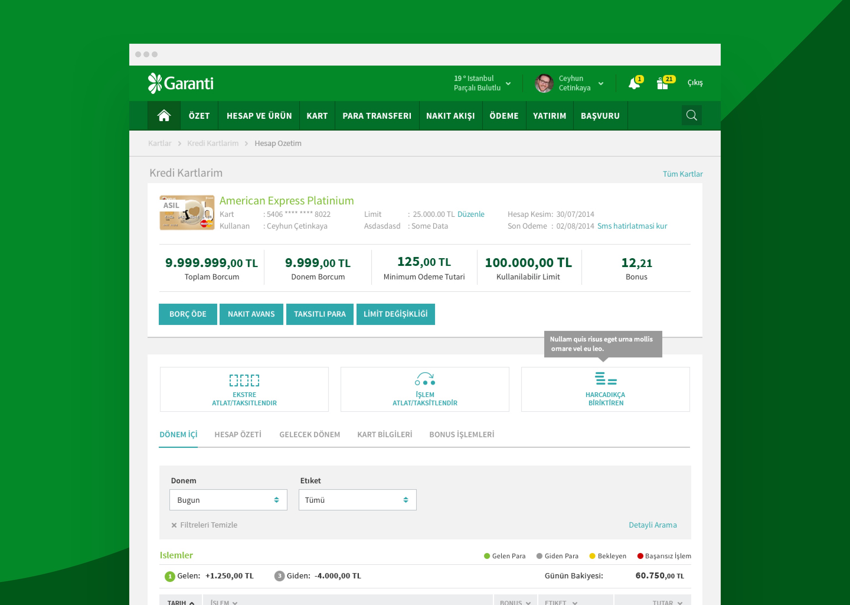
The system carried into the deeper pages. The credit card detail screen is a useful proof point because it is one of the densest surfaces in any banking app: balance, period balance, minimum payment, available limit, bonus points, primary actions, secondary actions, segmented transaction history, filters, contextual help. All of it composed from the component library. The screen still feels considered because the components had been designed to handle this kind of density without collapsing.
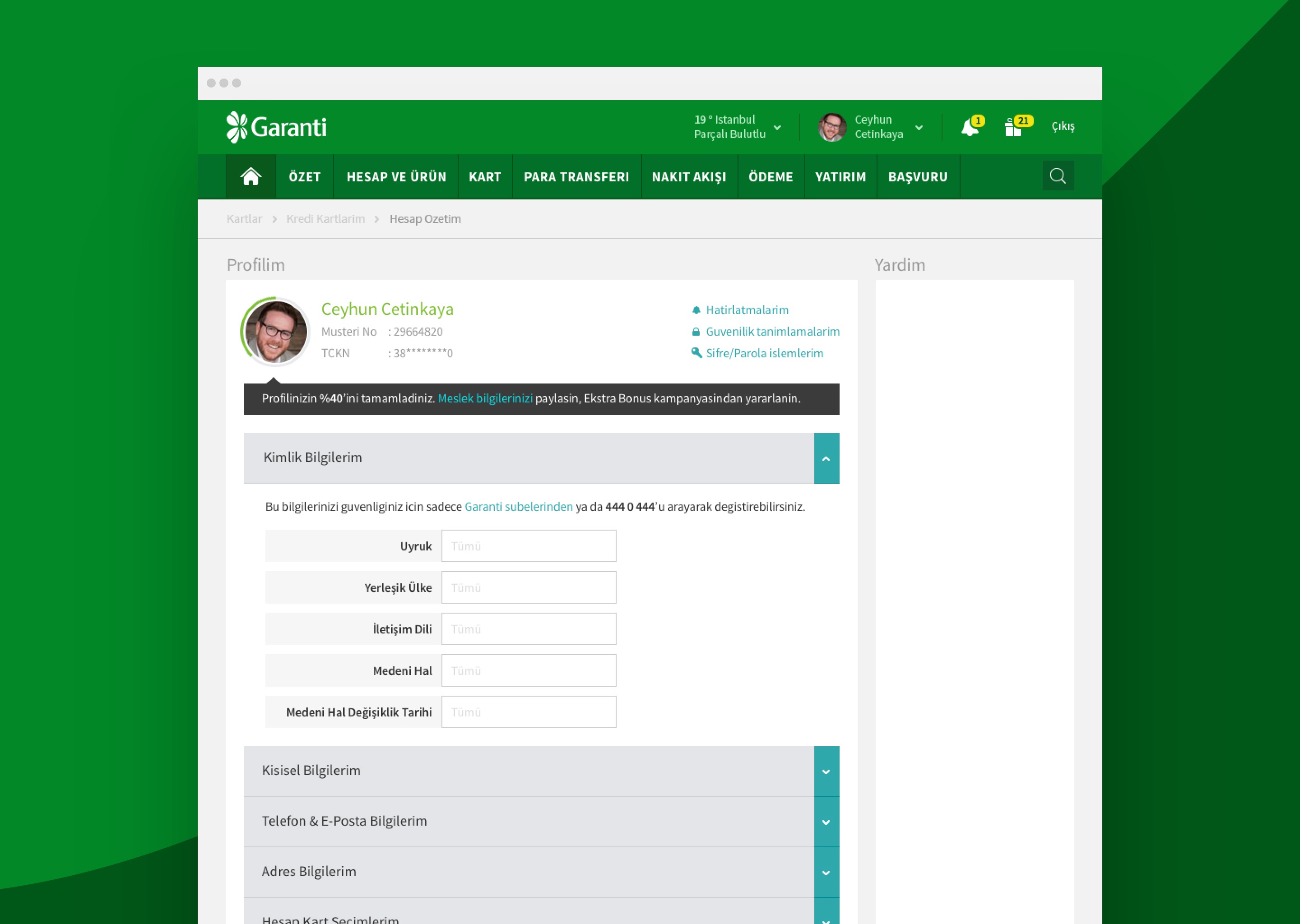
The profile area used progressive disclosure to handle the long list of attributes a Turkish bank is legally required to maintain about a customer. The accordion structure came from the component library. The contextual completion prompt at the top ("you have completed 40% of your profile, share your occupation to qualify for the Extra Bonus campaign") was the same trigger pattern used elsewhere in the platform, applied to a specific surface. The point of the system was that this consistency cost nothing to produce. The behaviour was already there.
What would change in 2026
Re-reading the work now, the surprise is how little of the architecture needs changing. The component system is still the right idea. The foundations layer is still the right shape. The dashboard frame still reads cleanly. The thing that has moved is the surface around it.
In 2016 the platform was desktop-primary with tablet and mobile as adapted views. By 2026 the centre of gravity has moved fully to mobile, and the desktop site is the secondary surface for the small set of operations that genuinely benefit from a larger viewport. The component system as we built it was designed to be responsive, but the design decisions inside each component were tuned for the densities desktop allows. A 2026 version would invert that and design mobile-native components that scale up rather than desktop components that compress down.
The dashboard would also move. In 2016 it was a single composed surface with a fixed information hierarchy. The personalisation hooks were limited to layout preferences. In 2026 the dashboard becomes a generated surface against the user's actual financial state, not their segment. The same intelligence that drives Bankia's Deck-and-Hand architecture in my next engagement applies here. The component system stays; the assembly logic on top of it changes.
The piece that has aged the best, and which I still draw on, is the foundations layer. Colour with semantic roles, status patterns, input rules, type. That layer is not where the time pressure of feature work usually goes, and it is the layer that determines whether a system holds. The Garanti foundations have held.
What happened next
The platform launched, the component system became the working reference for the bank's internal design and engineering teams, and the system was maintained and extended by them after the engagement ended.
External recognition followed. In Forrester's 2017 European Online Banking Functionality Benchmark, Garanti was ranked second globally with a score of 87 out of 100, behind only BBVA itself. By that point BBVA's stake in Garanti had been growing for several years, and the loop closed in a way that the timing of the original engagement did not predict.
The point that matters most to me, ten years on, is a different one. The site is still around 90% intact and in active use. Not preserved in archive. Not running because nobody has got around to replacing it. Actively serving Garanti's customers, on the same foundations, with the same component system underneath. The visual language has been refreshed once or twice. The structure has not needed to be.
That is the real test for a design system. A decade is long enough for fashions to turn over twice, for whole platforms to be deprecated, for entire engineering stacks to be replaced underneath the surface. Most design systems do not survive their first major refresh, let alone the operational pressure of a decade of feature work. This one did. A system that needs constant rebuilding to survive is not a system; it is a project. This one became infrastructure.
The principle I took with me, and still use, is the move the audit forced. Before designing the redesign, audit the system you are inheriting. Not the screens. The structure. The eight hundred pages were not eight hundred problems. They were a smaller number of patterns repeated inconsistently. You only see that if you stop to look. Most of the engagements I have led since have started with some version of that audit, in whatever form the work demands. It is the move that decides whether the rest of the work has structural weight or only surface weight.
There is a second principle, harder to apply and worth naming. When you are asked to redesign for a client who already leads their market, the temptation is to chase novelty: a louder home screen, a more fashionable interaction model, something visibly new. Garanti did not need novelty. They needed a structural reset that let them keep doing the thing they were already best at, at a velocity and consistency the legacy platform could not support. Shaping the shaper meant resisting the redesign reflex and doing the unglamorous work underneath. The visible parts followed.
The team carried the production phase. Four of us on the Fjord side, a different person owning each part of the visible work, and the day-to-day collaboration with Garanti's much larger internal teams making the system real screen by screen. The system reads as one piece because that small group made it so. My direction set the structure; they built it into a working product.