The engagement
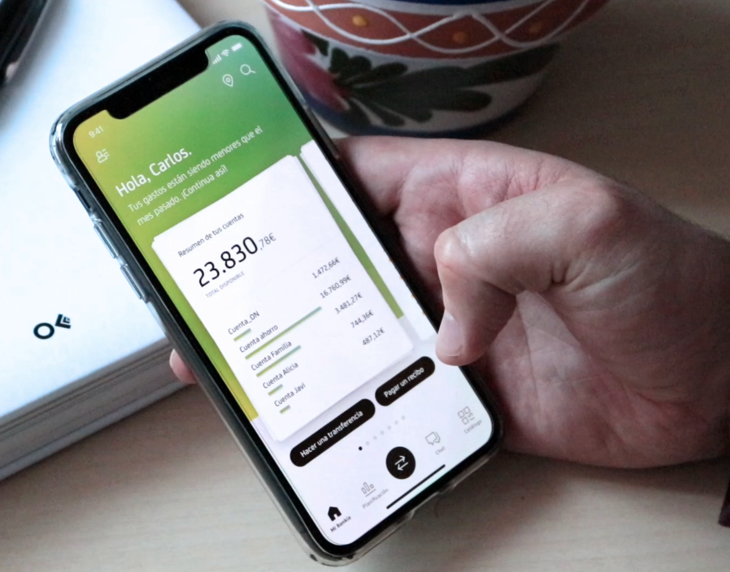
Bankia asked Fjord to rethink their mobile banking app. The remit was open. Not a feature audit, not a UI refresh. A concept, end to end, with the explicit hope that it would survive contact with the rest of the bank.
I wrote the proposal that won the work and led it from December 2018 through to July 2019. The shape of the engagement was unusual for an agency project: Fjord on design and concept, Deloitte on technical delivery, Movetia on build, all sitting inside the bank's own teams in Madrid. Three consulting parties around one product. I ran the design relationship across all of them, which meant the daily conversations with the bank's stakeholders and the working agreement with Deloitte's leads on what was buildable and when. We developed a good understanding across the parties, which is not the default outcome in a multi-vendor setup.
Stream 2 was the concept stream and I led the creative work. Nine weeks. Stakeholder reviews, ideation, wireframes, prototypes, validation. By the end of February we had a working clickable prototype, a strategic frame, and enough confidence from the bank that they extended the engagement into a full design stream. Seven sprints, on-site in Madrid. I stayed through to July as design director and creative lead, with a team I had a hand in shaping. The detailed execution belongs to that team. The structural moves and the creative direction are where I want to be honest about what I owned.
The chart that changed the brief
Early in the concept stream I pulled the active products distribution for Bankia's full customer base and spent an evening with it. Seven million customers, give or take. Three million of them digital.
The shape of that distribution did most of the strategic work for us.
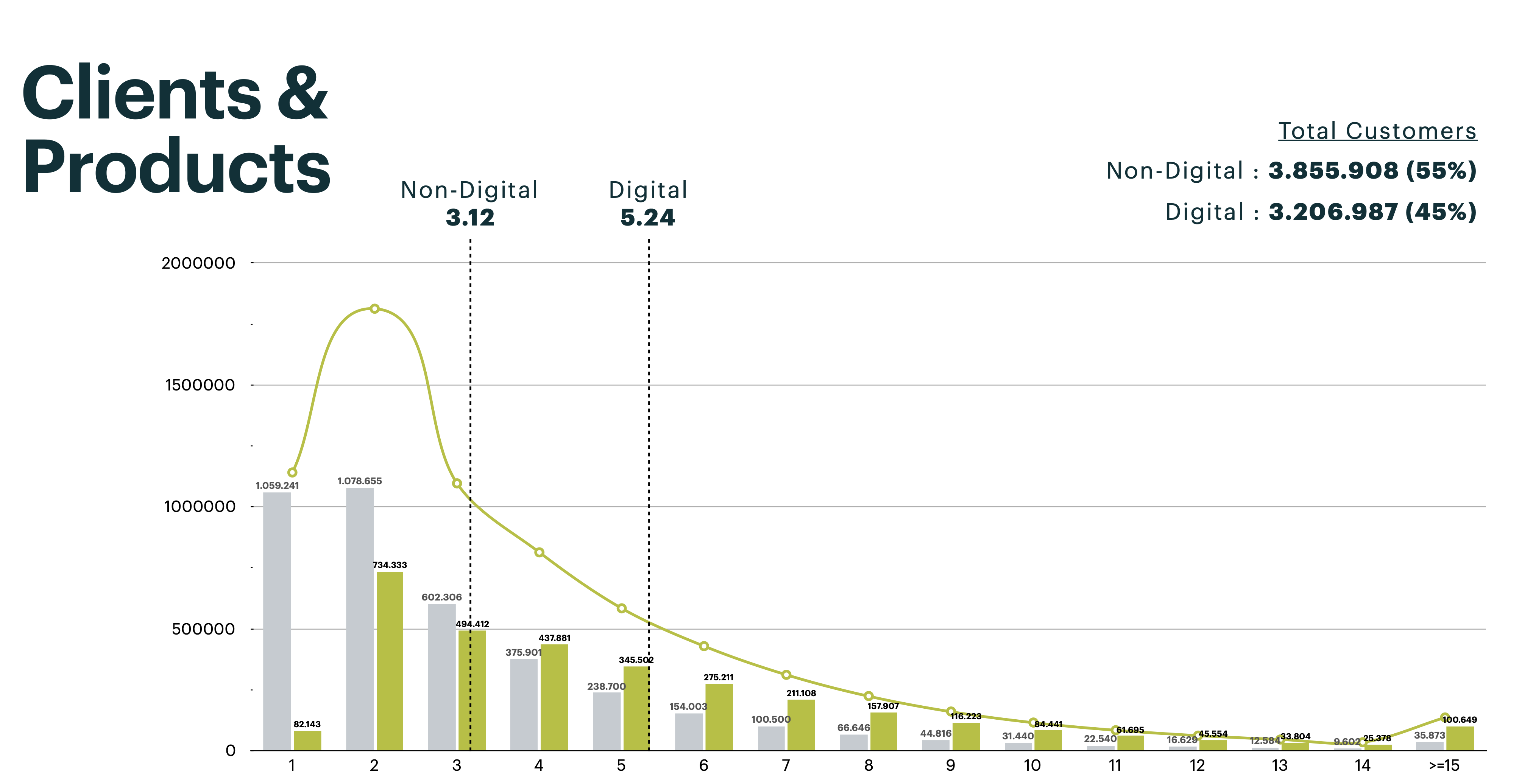
There is a cliff after three products per customer. The bulk of digital users sit at one to three products. A long, thin tail of high-product customers stretches out to fifteen and beyond. Two populations using the same app, with almost nothing in common about how they relate to their money.
The traditional Bankia user is in the tail. Multiple accounts, multiple cards, a mortgage, investments, insurance. They want density. They want to see everything at once. They have learned the app over decades and treat change as risk. They want their cockpit.
The digital-native user is in the head. One account, maybe a card, maybe a savings pot. They have N26 in the same phone. They want something light, fast, and a bit playful. The classical positional banking interface, with its functions and codes, makes no sense to them.
Most banks pick one of these audiences and lose the other. The brief asked us not to do that.
The decision: one app, two minds
We forked the experience without forking the product. The frame was mine: rather than choosing an audience, design two reads of the same component system. The Oversight and Action axes that organise the homepage came out of the same week.
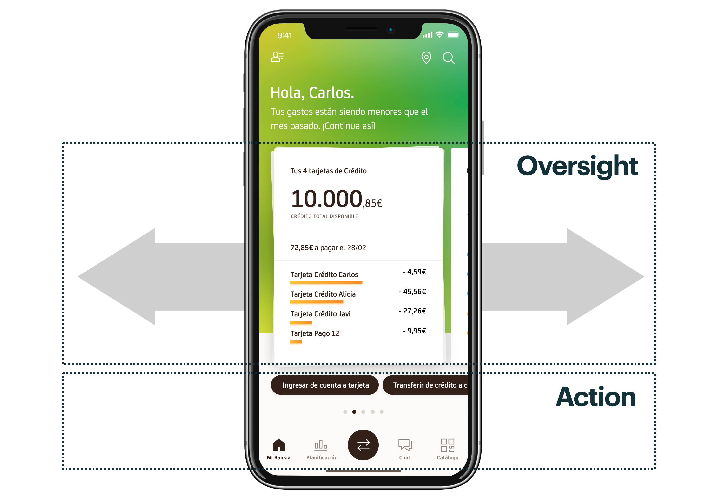
The home screen treats the user as living between two modes. Oversight, the non-triggered urge to check where you are. Action, the specific task that brought you in. We pulled these apart on two axes. Horizontally, the card system you swipe through to look around. Vertically, the call-to-action and tab bar that move you straight into the work.
For the long-tail high-product user, the cards behave like a configurable cockpit. Account summaries, card balances, recurring payments, investments, all stacked and scannable. They can keep adding, keep monitoring, keep their muscle memory.
For the head-of-the-curve user, the cards behave like a feed. A few canvases, generous spacing, smart copy, room to breathe. They get a banking app that feels closer to Instagram than to a legacy positional grid.
Same component system. Same backend. Two reads.
Cards as canvases
The unit of the new homepage is the card. Two levels. I originated the card concept and the two-level hierarchy in the concept stream; the team developed the visual language, the per-product treatments, and the contextual states across the production sprints.
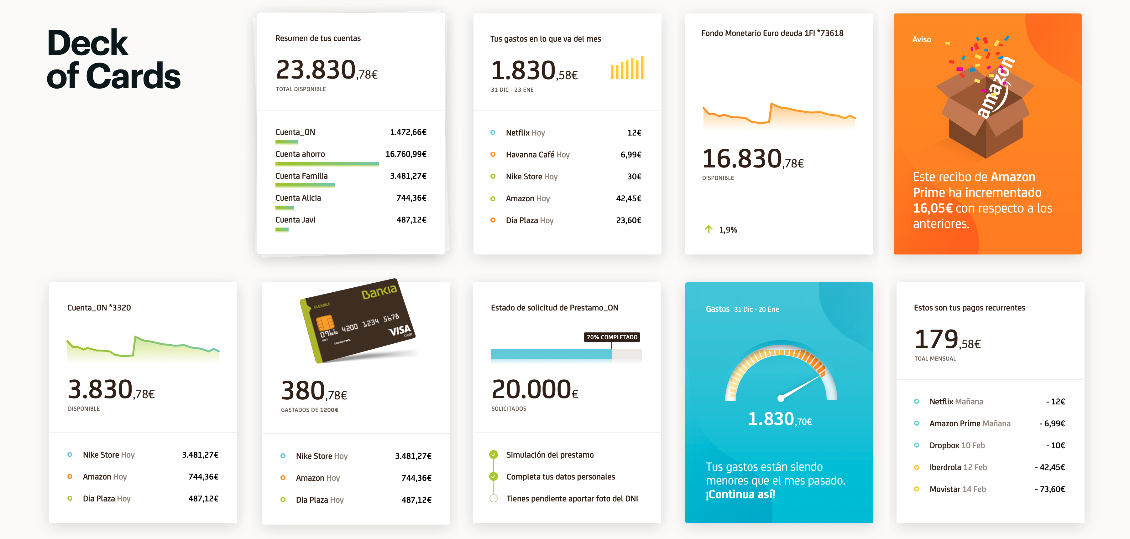
A summary card for a class of product. Tap in and you get detail cards for each instance. This replaces the classical navigation pattern (function code, position one, position two, drill down) with progressive disclosure. The user explores in the direction of their intent rather than memorising a function tree.
The reasoning that mattered. Cards are easy to scan. They carry contextual actions. They scale. They do not force the user to absorb everything at once, which is what the existing app, like most banking apps, was asking them to do.
They are also future-proof. With a personalisation layer behind them, order and content adapt to the individual. The 47-year-old with five accounts and a mortgage sees a different first card than the 29-year-old with one current account and a Bizum habit. Neither has been moved to a different app.
The Deck and The Hand
This is where the production stream pushed the concept somewhere I had not fully seen at the wireframe stage. The Deck and Hand metaphor is mine; the tier categorisation, the rules behind the per-user hand, and the full taxonomy of trigger placements were developed by the team across the sprints, with my direction.
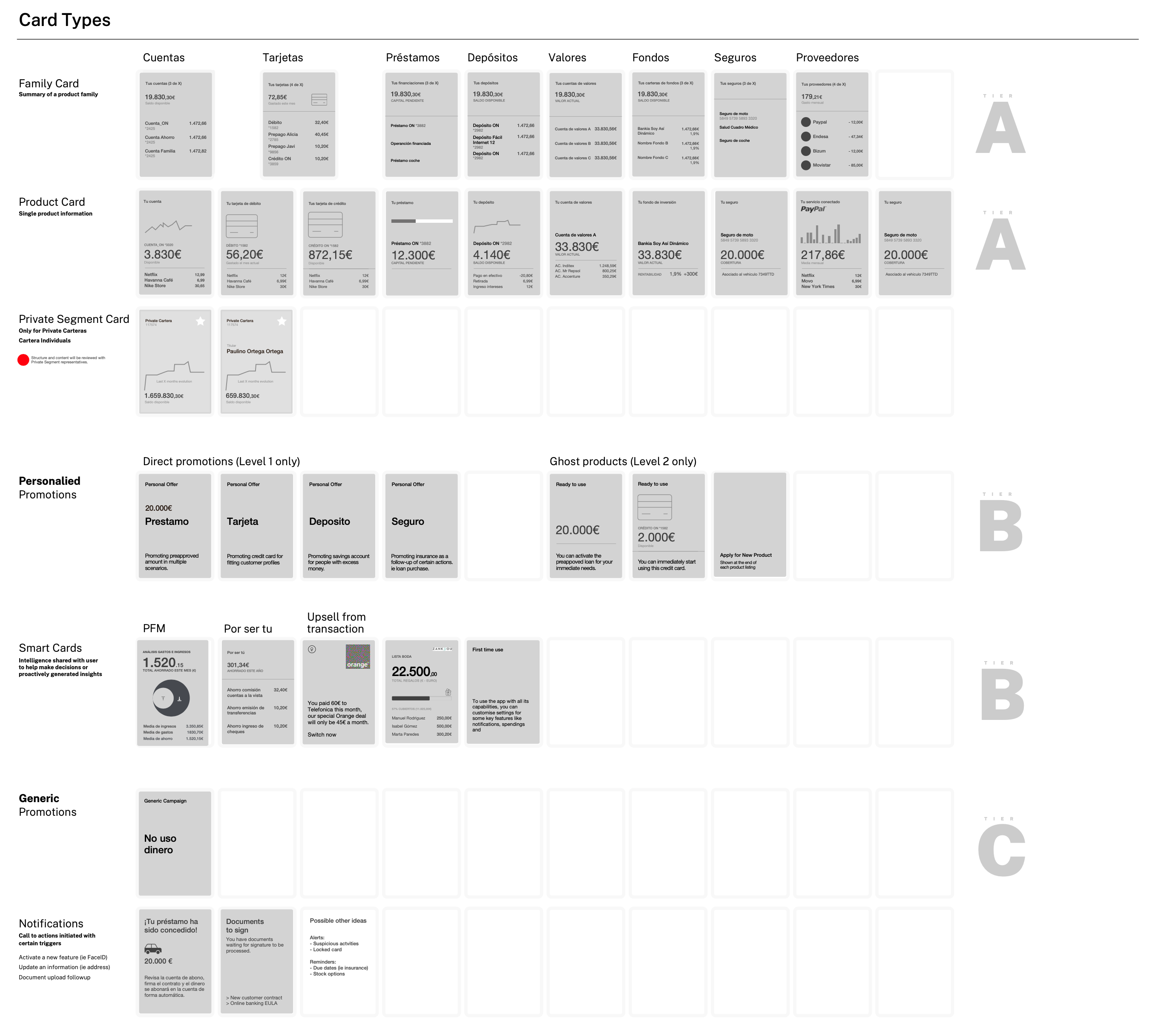
Cards are a content unit. To make them work at the scale of a bank, with twenty product families, a long list of contextual prompts, and per-customer personalisation, the system had to be designed as a card game.
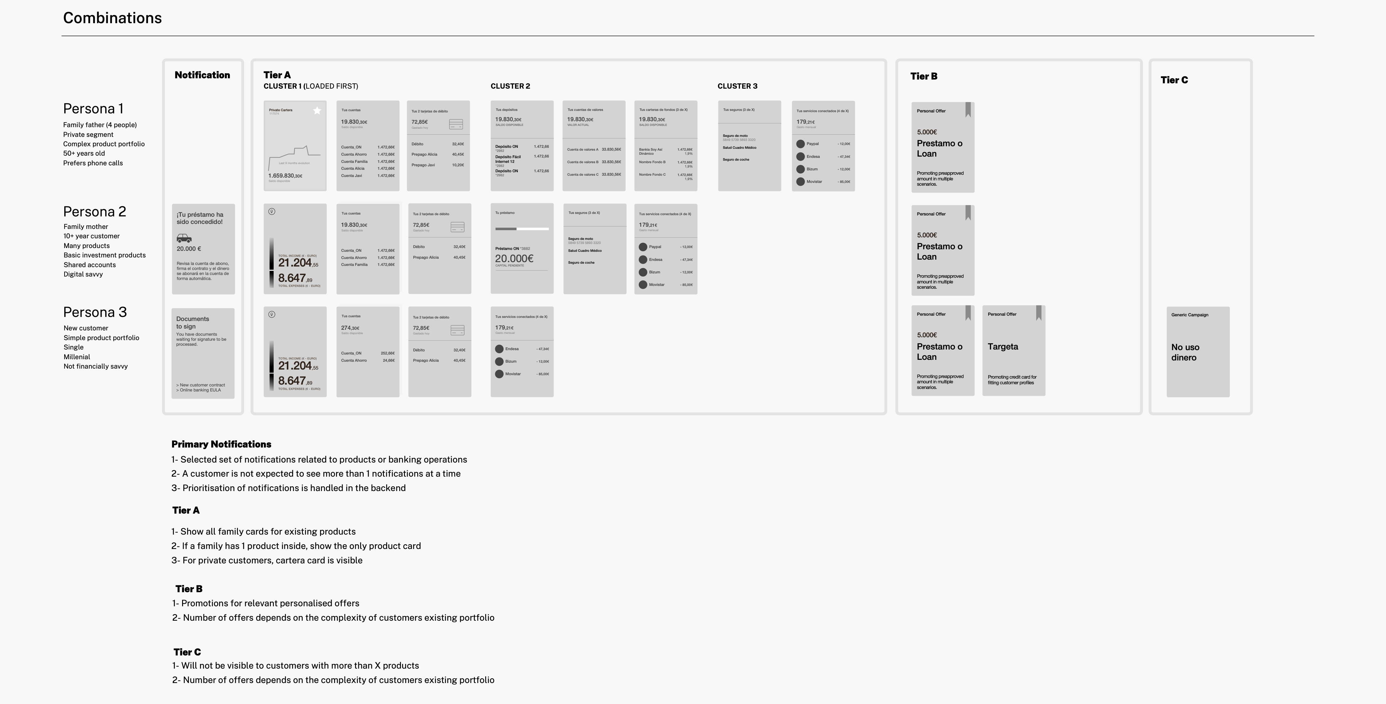
The Deck is the longlist. Every card the app can show, organised into six types: family cards (summary of a product class), product cards (single instance), smart cards (intelligence layered onto user data), cross-sell and upsell, basic promotion, and notifications. Each card sits in one of three tiers: A for owned products, B for relevant suggestions, C for general promotions. The Deck is authored. It does not change per user.
The Hand is the per-user selection drawn from the Deck. A ruleset decides what each customer sees on their homepage and in what order. A private-segment customer with twenty accounts gets a Hand built from Tier A family cards plus their pension and investment summaries, with Tier C cards held back. A customer with two accounts and a Bizum habit gets fewer cards, more whitespace, more room for a smart card to surface a useful nudge.
The same architecture handled the trigger system. Instead of banners and pop-ups bolted into screens, we modelled marketing as conditional rules with placement metadata. If active balance is near zero, trigger a notification recommending the overdraft account. If the recent action is at a particular vendor, trigger an in-card CTA for a co-branded card. Each rule had a trigger, an action, a surface, and an analytics tag. The Sales Patterns work catalogued every legitimate placement in the app: bottom CTA in card, full promotional card, oversight surface inside transaction lists, end-of-flow upsell, chat suggestion. Six surface types, governed by rules, instead of seventeen banner sizes ad-hoc.
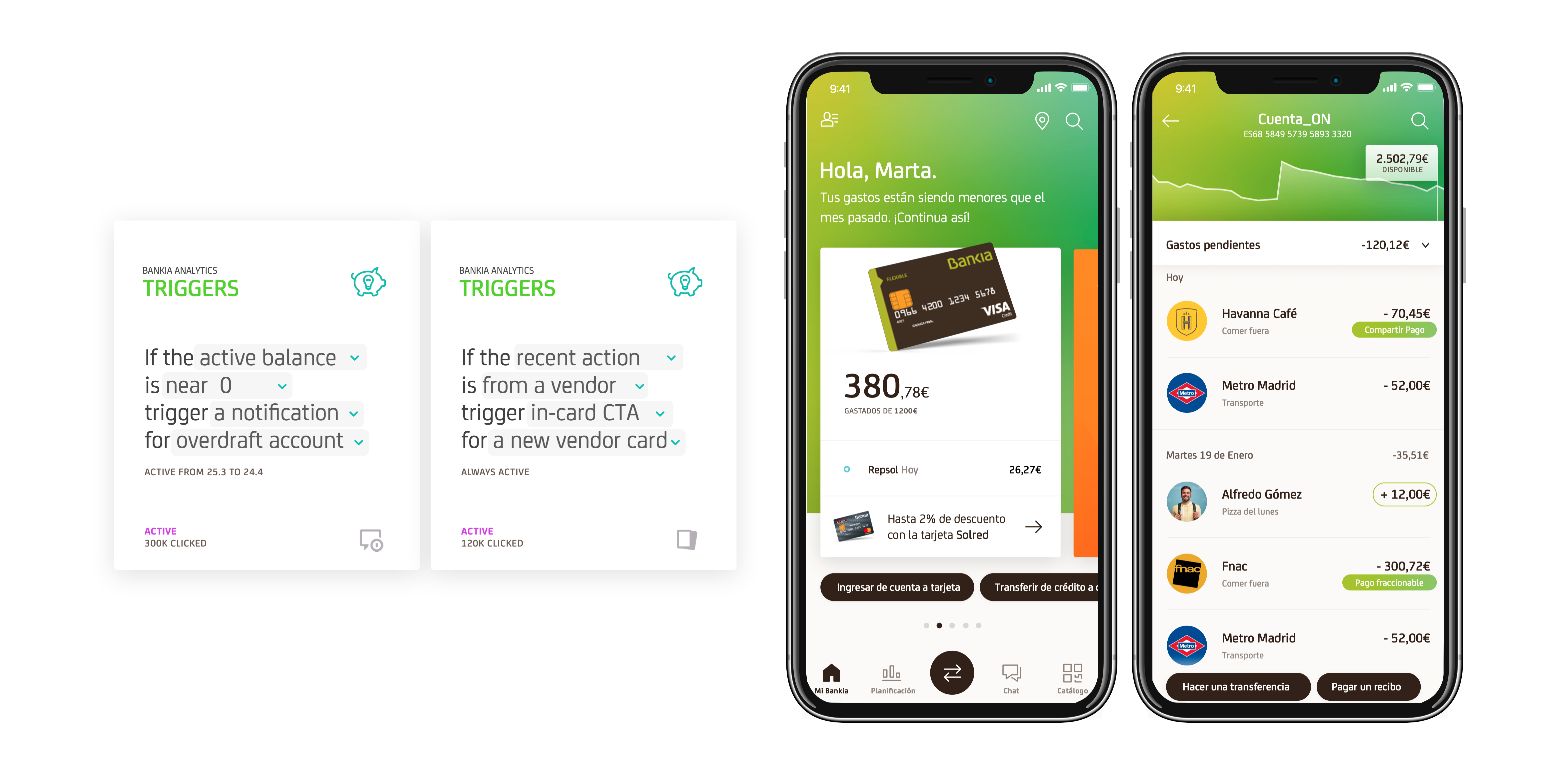
The bank's marketing team got the contextual offers they wanted. The user got fewer interruptions and more relevance. The system was designed to be composed by rules, not authored by hand. In 2019 those rules were going to be written by humans. The architecture did not assume that.
Distributed PFM
Personal Financial Management was a separate destination in the existing app. A place you went, looked at a chart, and left. We treated it as a capability that should live everywhere.
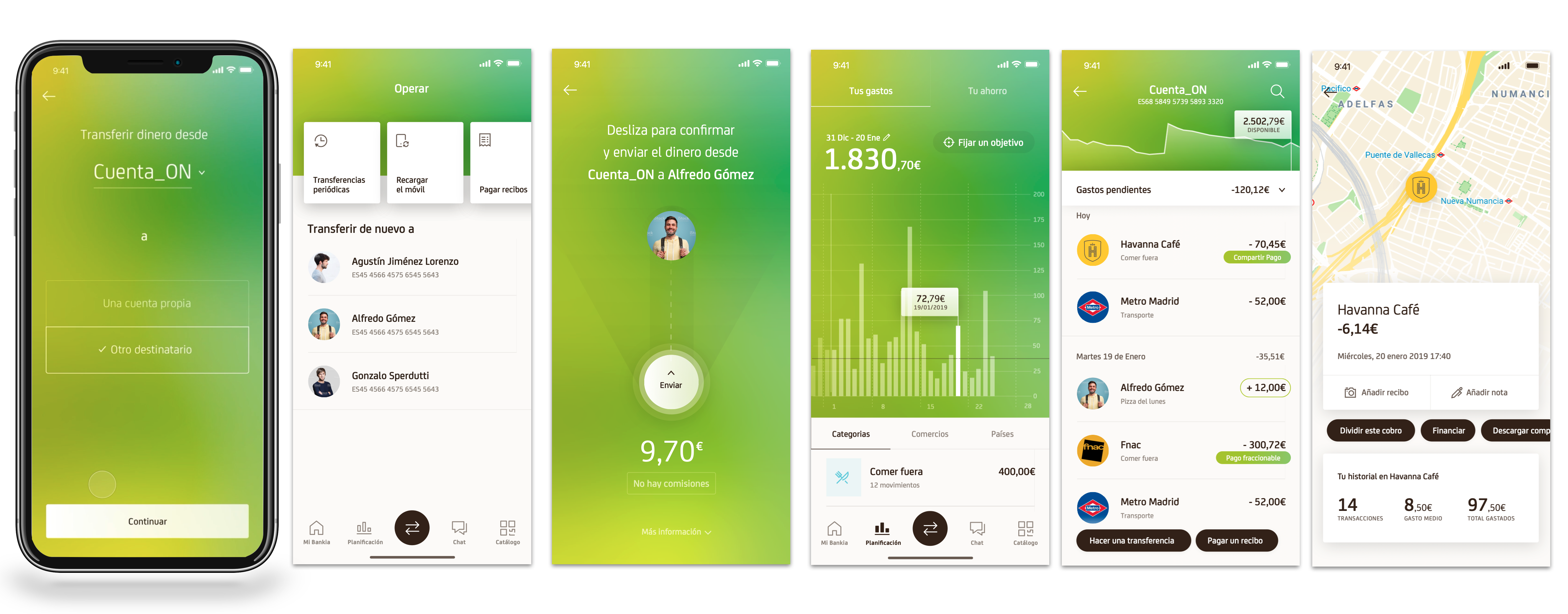
Planificación stayed in the tab bar, because some users want to walk in the front door. But the same intelligence surfaced inside transaction details (split this charge, finance it, set a goal), inside cards (you have spent less than last month, keep going), and at the end of operational flows (you just paid this bill, here is what your recurring spend looks like).
The same logic produced the chat layer. Chatbot for self-service, human agent for the rest. We did not make the user choose. One conversation surface, one history, with a hand-off in the middle that the user does not have to manage. This was 2019. The mental model holds up.
From concept to system
The production stream is where most of the work actually lived. The concept gave us the strategic frame and the homepage gesture. Sprints 1 through 7 turned that into a system app teams could build against.
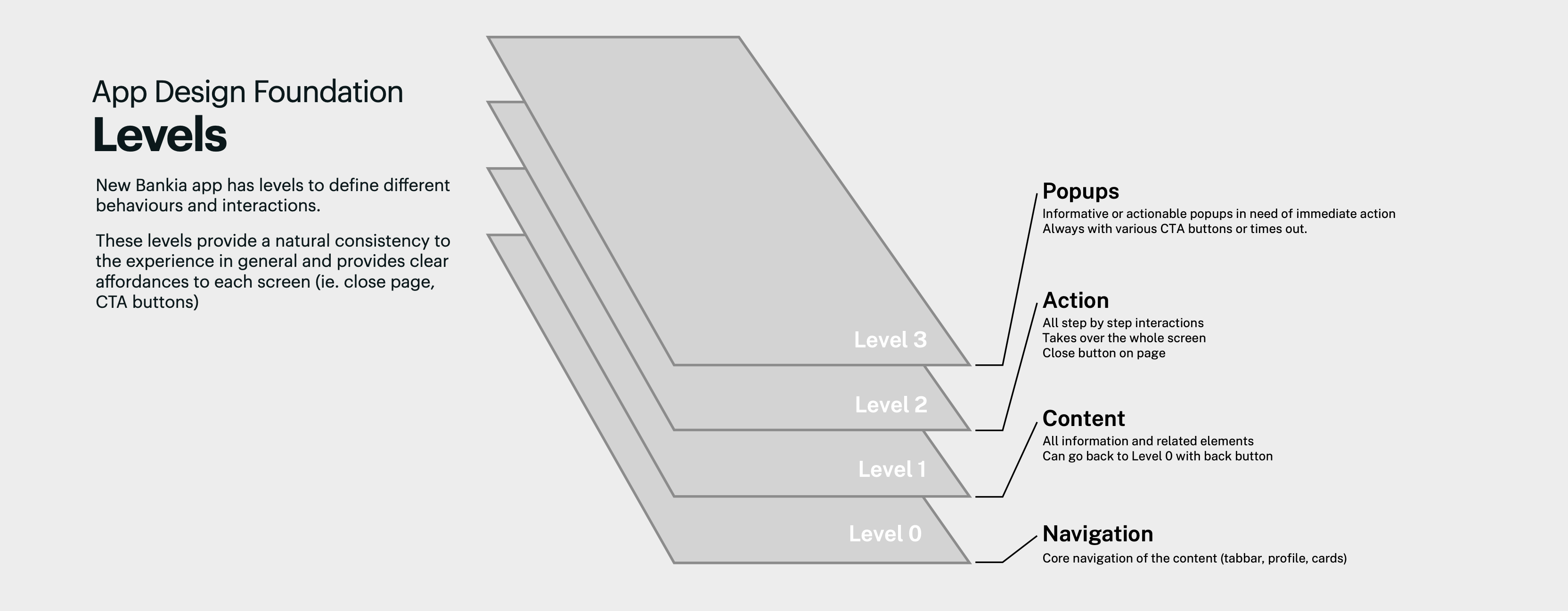
We defined four interaction levels: Navigation (tab bar, profile, cards), Content (information pages), Action (step-by-step flows that take over the screen), and Popups (immediate-attention prompts). Every screen lives at one level. The affordances (back button, close button, CTA placement) are determined by the level, not redrawn each time. This is what framework-level design produces. Patterns app teams can apply consistently without re-deciding the shape every sprint.
We stress-tested the card system against a deliberately hard case: a private-segment customer with twenty accounts, seven cards, multiple investment products, and a pension. The default card view stayed playful and scannable, but at that volume it would have been wrong. So we let list views in at two levels, each answering a different problem. Inside a single product family, once a customer holds six or more, the view switches to a list on its own. Swiping through that many cards is tedious and there is nothing to decide, so the app drops the work rather than asking for it. Across the whole homepage, for a customer with more than five product families, we offered a list view instead, surfaced as a card at the end of the deck. That one we offered rather than imposed. Moving the entire homepage from canvas to cockpit is a preference, not a tedium to fix on someone's behalf. Automate the removal of tedium, offer the change of paradigm. The point was never to force the cockpit user into the canvas. It was to give them both, on their terms.
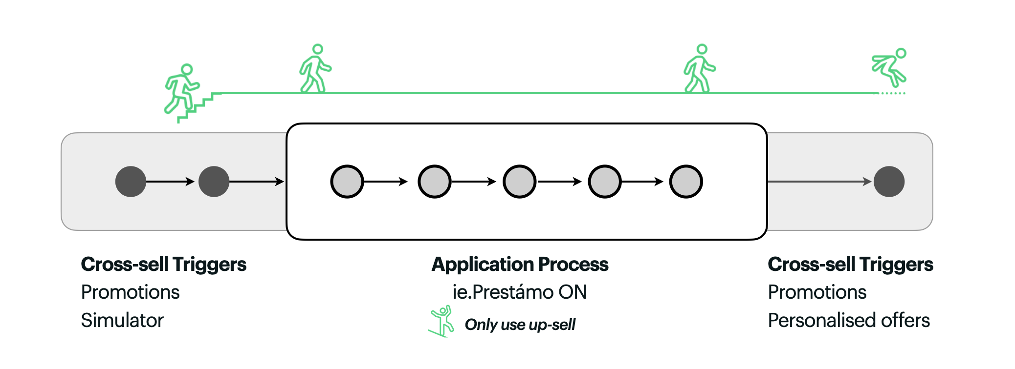
The sales work got its own governance. We mapped the principles of a healthy sales funnel: start with the need, not the data; do not distract inside the flow; keep it linear. Inside an active sales funnel, only upsell is allowed (something tied to the current product), never cross-sell (something unrelated). Cross-sell triggers are permitted before the funnel starts and after it ends. The Prestámo ON loan flow became the worked example. Three points of trigger entry, a clean funnel, and a thoughtful end state that opens new doors without forcing them.
Final deliverables
The production stream had to end somewhere concrete. Over four sprints we scoped and delivered the full mobile app redesign: more than four hundred screens across thirty distinct functions, from everyday operations to the sales and personalisation flows the architecture depended on.
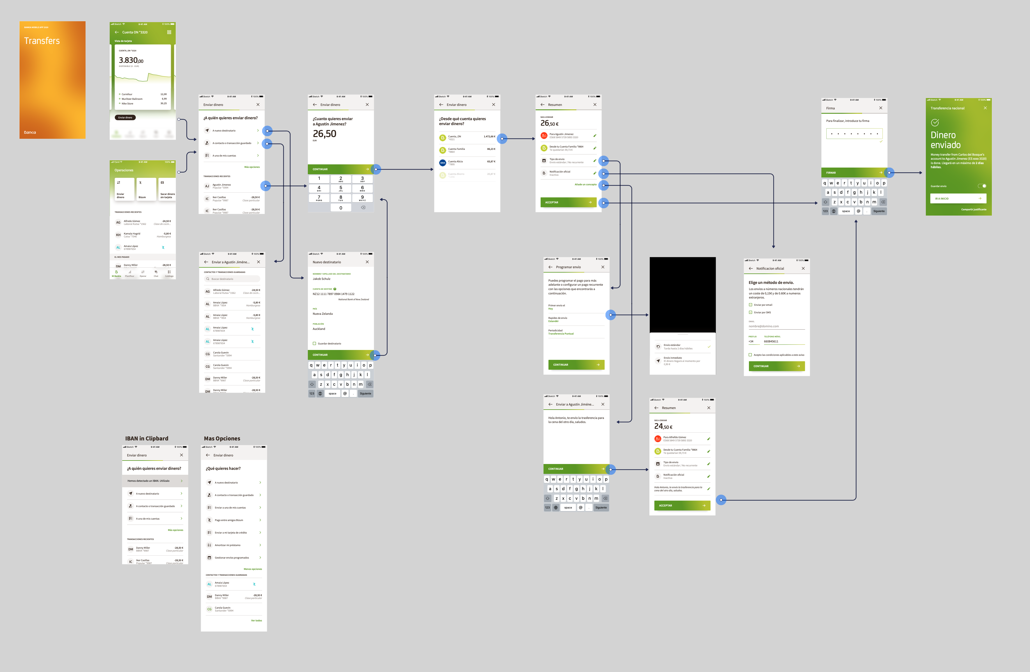
Each function was documented at two levels: wireframes for structure and flow, then detailed visual design for every state the build team would need. We produced animation guidelines so motion stayed consistent across handoffs, and a complete icon set for the card system and the action flows. The package went to Deloitte and Movetia as the production reference, not a deck of intentions.
We stayed through QA on the final outputs, checking implementation against the design system screen by screen until the application was ready to launch by the end of the year.
What would change in 2026
Re-reading the work now, the surprise is how much of it survives. The architecture is right. What changes is the engine that drives it.
In 2019 the Deck was authored, the Hand was assembled by rules I wrote with the team, and the triggers were a finite list of conditions a marketing operations person would maintain in a spreadsheet. The system was designed to be composed, but the composer was a human.
In 2026 the Hand is generated continuously against the user's actual state, not their segment. The Deck stops being a static longlist and becomes a generative surface, with cards composed on demand from a smaller set of primitives. The trigger rules stop being hand-authored and become learned from how users actually respond to suggestions across the base. The Mindsets axis (when, where, how hard someone thinks about money) stops being a research artefact and becomes a continuously inferred signal.
Even the chat surface flips. In 2019 it was a help channel. In 2026 it is plausibly the primary entry, with the card system becoming the artifact layer the chat produces: intent in, structured surface out.
The strategic move stays. Two audiences in one product, addressed honestly, without making either of them second class. The structural break in the data tells you what the product has to be.
What happened next
App launched as planned by March 2020 with more features to be added progressively. By the time the production stream was deep into Sprint 6, the broader picture had shifted. Bankia was in the early stages of being acquired by CaixaBank, a substantially larger Spanish bank. From the inside the work continued, sprints kept landing, the design system kept hardening. From the outside, the calculus changed. A new mobile app was always going to be a bold move for Bankia. Bold moves before an acquisition carry a different weight. The pattern landed in pieces. The full system stayed in the deck.
Bankia merged with CaixaBank in 2021.
This is honest work at this end of consulting. You build a coherent system that fits where the client is. The client moves. Some of what you built lands, some of it does not, and the parts that do not still teach you what you came to learn.
What I took with me, and still use, is the principle the 3-product cliff taught me. Look for the structural break in your user data before you decide what the product is. The break tells you what the product has to be. The Deck-and-Hand architecture became a way of thinking about every personalised system I have worked on since. The Levels foundation became the way I structure interaction design for any complex enterprise product.
I was also lucky in the team. A lot of director-level work means soloing the conceptual moves and handing them off; on this one I had a team I could shape, trust, and give serious creative responsibility to. The detailed work across the production sprints is theirs. The system reads as one piece of thinking because they made it so. That is not always how these engagements feel from the inside, and it is worth noting when it does.