The engagement
Yapı Kredi came to Fjord with a refresh brief and an honest constraint. The fleet was over four thousand strong across Turkey. The hardware was Windows machines running an Internet Explorer based browser, and the existing ATM front end was a clunky stack of code that had grown by accretion since the late nineties. They wanted a refreshed design. What they needed more, and named openly, was a clean rebuild of the front end.
I led the design from concept through to the shipped guideline and codebase. The engagement covered strategy, interaction design, the visual system, the front-end build, prototyping, and the design guideline that would govern the next decade of work on the fleet. I ran the team across all of it: interaction designers, visual designers, and a small front-end pair we ran inside Fjord rather than outsourcing.
The constraint was the brief
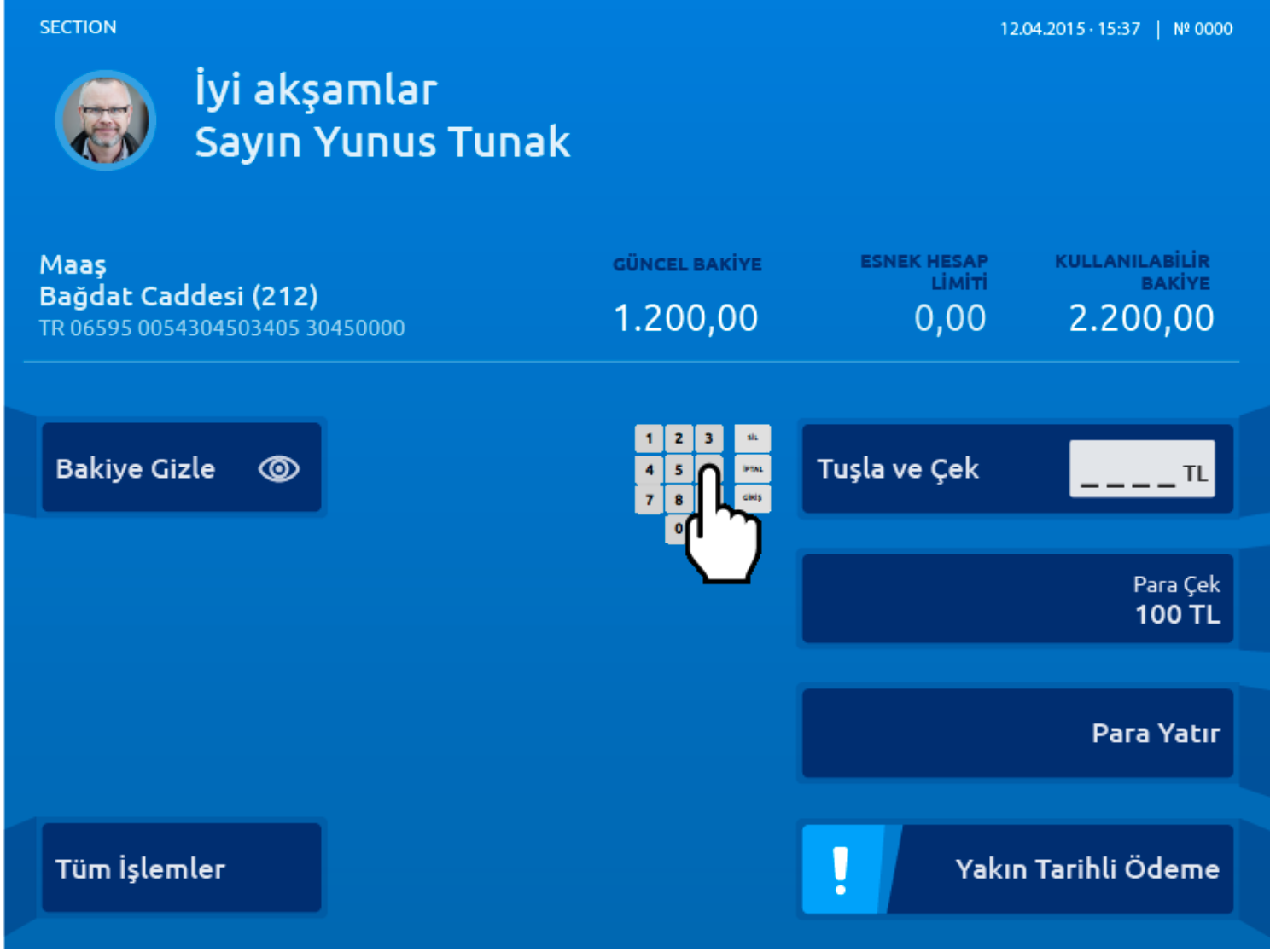
The interesting design problem was not the screens. It was the machine. Eight physical buttons, four down each side of the screen. A numeric keypad below. A card slot, a cash slot, a receipt slot. Most of the fleet did not have a touch screen. Some of the newer units did. The same software had to run across both, and on hardware that could not be replaced for years.
Most banks treat ATM design as a screens-only problem and end up with two systems: one for the old machines and one for the new. We chose not to do that. The eight-button geometry stays as the base assumption, and the touch units inherit the same layout. The interaction model is the same across the fleet, which is the only way a guideline can hold for over four thousand machines that get replaced on different cycles.
The performance constraint was the other half of the brief. The legacy front end was heavy, slow, and brittle. The machines could not run a modern web stack. So I reframed performance as a design constraint rather than an engineering one. Could we deliver the whole interface in smallest possible footprint?
The final build came in at around 50KB of CSS and JavaScript. Accompanied by SVG for the iconography and the visual chrome, simple PNGs for the few illustrated moments. The interface ran cleanly on machines that the previous stack had brought to a crawl.
The counter-intuitive part is what we did with the headroom. The interface had become so much faster than the previous one that transitions felt jarring. So we deliberately slowed them down. Not to fake load time, but to give the eye somewhere to follow when a screen changed. Performance was used as a budget for considered motion, not as a flex.
Four blocks for every screen
The structural move was to define every screen as four blocks stacked vertically: a thin status bar, an information area, a detailed tracker, and a button zone that mapped to the eight physical buttons. The blocks could expand and contract, but the order and the role were fixed.
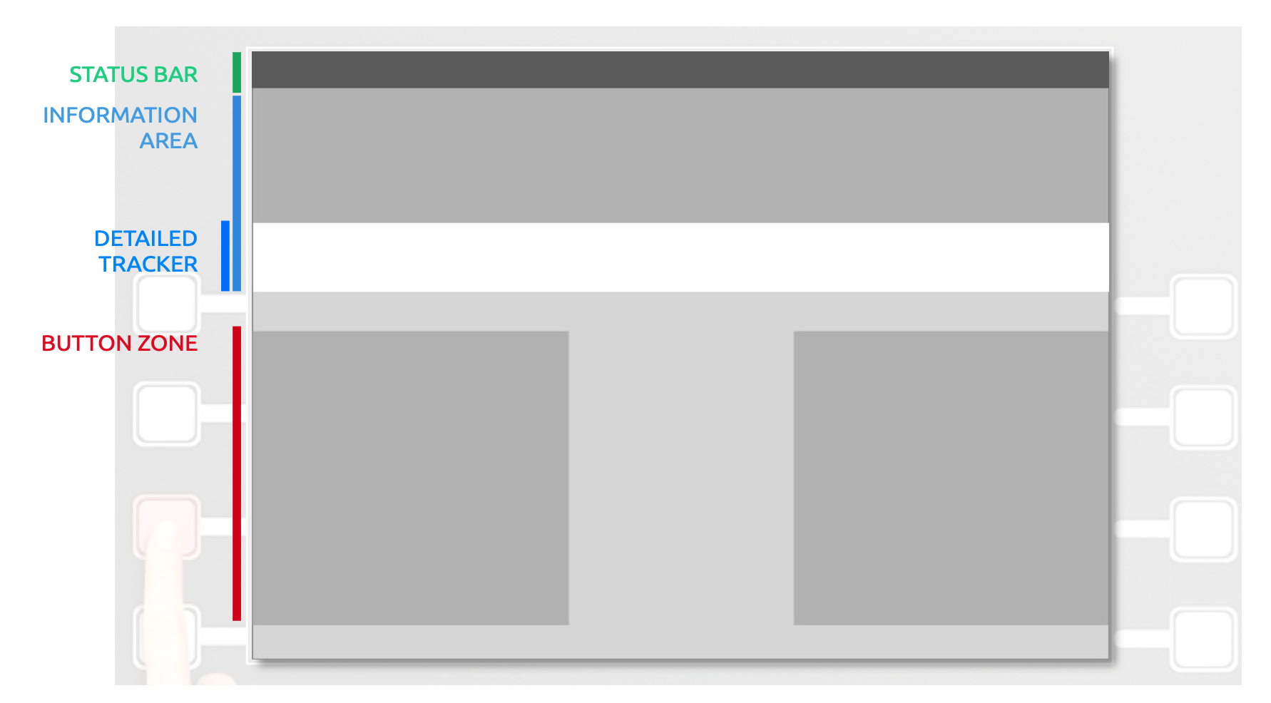
This is the kind of structural decision that pays back for years. Once the blocks are fixed, every new feature has a known place to live. The status bar always tells the user where they are. The information area always carries the main message. The detailed tracker carries the working data, balances, payment plans, account lists. The button zone carries the actions, ordered from top right and read clockwise.
The button rules were the part that made the guideline buildable. Ordering starts from top right. The primary action sits bottom right. Back is always bottom left. Supportive actions only ever appear on the top row, where they sit next to the tracker rather than below it. Eight slots, but with conventions that meant the user never had to scan all eight to find what they needed.
The cardboard rig and the apple
Hero of our engagement was the cardboard rig prototype. It was a simple, low-cost way to test the interaction system with stakeholders without the need for actual hardware. I had a Makey Makey board sitting in a drawer, a kit designed to turn anything conductive into a keyboard input. I had been waiting for a project to use it on.
We turned a desktop monitor in the studio. Built a cardboard frame around it with eight button positions cut out. Wired four of the positions to the Makey Makey, which was the board's input limit. Ran the prototype off Keynote initially, with each slide acting as one screen in the flow. To trigger the buttons, the user had to complete the circuit, which meant holding something conductive. Took an afternoon to build, and a few more to refine the interaction system. Eventualy we upgraded to a simple HTML/CSS/JavaScript prototype to run the rig.
We gave them an apple.
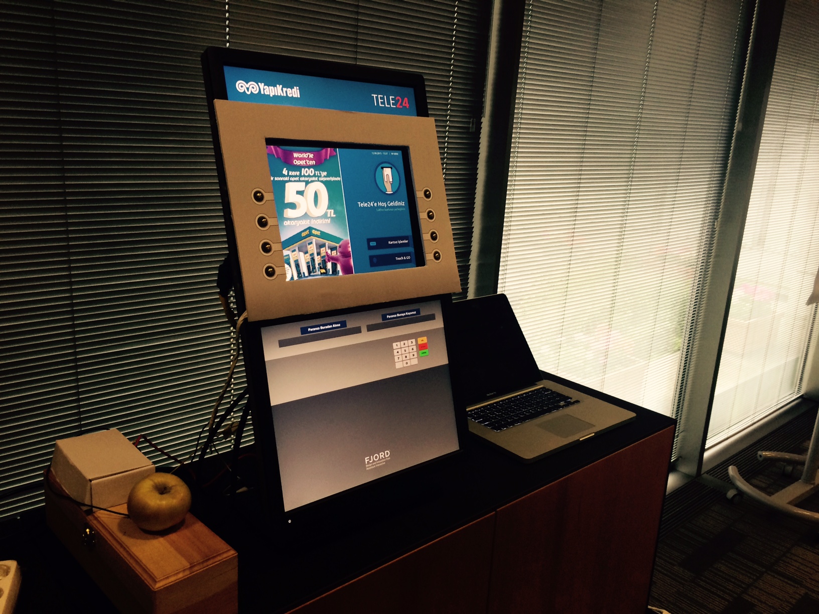
The first time we ran it with stakeholders from the bank, the room went from polite curiosity to genuine engagement inside thirty seconds. Holding the apple is a small act of physical commitment that turns "look at this concept" into "use this concept." Nobody who held the apple critiqued the prototype from a distance. They got into it.
The fact that the rig was obviously rough did most of the work. It signalled we were testing the experience, not selling the polish. Stakeholders gave us better feedback because they were not being asked to approve anything. They were being asked to use a thing and tell us what felt off.
Testing next to the actual machines
ATM design is a harder problem than the brief suggests, and it is harder for a reason that only becomes obvious once you try to research it. The interface is almost always ignored. People notice it only when something breaks: they cannot withdraw, they cannot find the step they need. When it works, even when it is clunky, the moment the cash appears the experience evaporates. Nothing sticks. We ran quantitative testing early and at scale. The results were broad enough to look respectable on a slide and generic enough to be useless. Very few people could articulate what had felt tricky or what had felt clean. That silence was the insight: we needed methods that could catch the experience before it was forgotten, not surveys that asked people to recall it.
The internal validation came from the cardboard rig. The external validation came from a guerrilla setup we ran on iPads, in branches and on the street, next to the working ATMs that the new system was meant to replace.
Around fifty users across multiple sessions. The recruiting model was simple: catch people who had just used an ATM, ask if they had a few minutes, run them through the new flow on the iPad. The freshness of the comparison was the point. They were not recalling what the old ATM felt like; they had used it ninety seconds earlier. The feedback was sharper than anything a recruited focus group would have given us.
This is the kind of testing that gets dismissed as too small to be statistically meaningful, and it is. It is also the only testing that catches the things a usability lab cannot: that people felt rushed because someone was waiting behind them, that the receipt slot was hard to find in low light, that the eight-button rhythm felt different when the user was holding shopping in one hand. Real context is its own data.
The guideline as the deliverable
The artifact that survived the engagement was the design guideline. Around seventy pages, covering the four-block structure, the button rules, the iconography, the input fields, the error and warning states, the receipts, the accessibility mode, the substitute scheme for when the machine was under maintenance. The guideline was the thing the bank's internal team and their vendors would use for the next decade.
The guideline was opinionated about what the system would not do, which is the part most guidelines skip. Buttons could not be longer than two hundred pixels with an icon, or two hundred and fifty without. If a label did not fit, you used a two-line button. If it still did not fit, you rewrote the label. There was no overflow, no wrap, no shrink to fit. Constraints that look harsh on the page prevent a fleet of over four thousand machines from drifting into chaos five years later.
A parallel stream: what an ATM could be
Alongside the system rebuild we ran a concept stream that asked a different question. ATMs are physically fixed devices in known locations, with known orientations and known users at known times. That is unusually rich context for a piece of hardware, and almost no bank uses it. The base interface treats every machine like every other machine, at every time of day, with every user. We wanted to push against that.
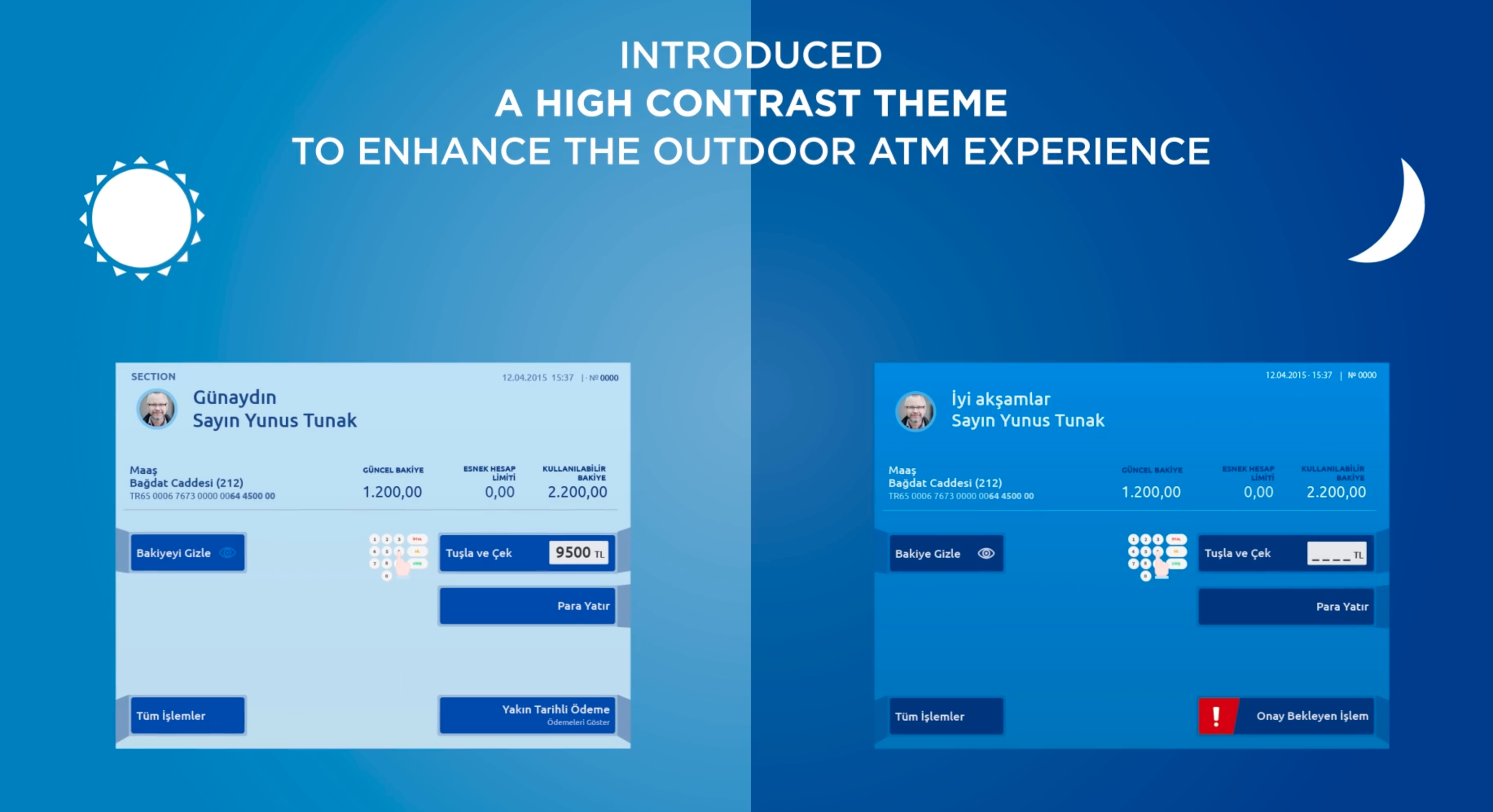
Daytime, night-time, and direct sun
The screen needs to behave differently depending on what the user is standing in. In direct sunlight, contrast has to go up sharply or the interface becomes unreadable. At night, the opposite problem matters more, and it is specifically a Turkish problem. A bright ATM screen at night in a quiet street blinds the user to their surroundings. Their eyes adjust to the screen, the area around them goes dark, and any sense of who is nearby disappears. In neighbourhoods where ATM muggings happen, this is not a usability issue. It is a safety issue.
We proposed a dimmed and inverted night mode, triggered by ambient sensors and clock time, that kept the interface legible without flooding the user's vision. The fix was small. The reasoning behind it was the point: the device knows where it is, knows what time it is, knows the lighting conditions, and can act on all three without any hardware changes. Although it turns out holding a central data about the machine's orientation ended up being a challenge for the Bank's IT team. So they applied it as a generic time of day mode rather than a contextual one.
The beacon-and-phone concept
The piece I am proudest of from the concept stream was a phone-led interaction that used a Bluetooth beacon on the ATM. The bank's mobile app already knew which customer you were. The beacon let it know you were standing next to a specific machine, often before your turn in the queue. So you could prepare the transaction on your phone while you waited: pick the account, set the amount, choose receipt or no receipt. When your turn came, the ATM had your request loaded. One tap on the phone activated the machine and dispensed the cash. No PIN entry, no menu navigation, no touching the keypad.
The benefits stacked. Speed, because the slowest part of an ATM transaction is human input, and we moved it to a familiar interface the user already trusted. Hygiene, which was a fringe concern in 2016 and became the default by 2020. Security, because the PIN never appeared on a public screen and the keypad never had to be touched. Throughput, because the time-per-customer dropped enough to matter to a busy branch.
The beacon concept was deployed across approximately 100 ATMs as a live pilot. A small fraction of the fleet, but a real one, and the only piece of the concept stream that crossed from idea to deployment during the engagement.
What this taught me
Treat the constraint as the brief. The eight-button hardware and the performance ceiling were not problems to design around. They were the structure that gave the system its shape. The strong constraints made the work coherent. A team designing for unlimited capability would have produced something less consistent.
The cheapest prototype that triggers physical commitment beats the polished one every time. The cardboard rig and the apple did more for stakeholder confidence than any clickable prototype could have. The iPad in the branch did more for user insight than a recruited lab study would have. Roughness signals you are testing the thinking, not the surface. People give honest feedback when they are not being asked to approve a deliverable.
System work pays back on the time horizon of the system. The four-block structure and the structural rules gave the system its shape and coherence. Rest of the project was about details and onboarding internal teams to the new system. Bank's business analysis teams adopted the guideline as their own, and the new system was rolled out across the fleet. And I am proud that the system is still in use today.
Run the concept stream alongside the production work, not after it. The contextual modes, the location-aware offers, and the beacon concept all came out of the same engagement that produced the system rebuild. Concept streams that sit separate from delivery work tend to die when the deck closes. Concept streams that share a team and a deadline with the production work get tested, get argued over, and occasionally get shipped.